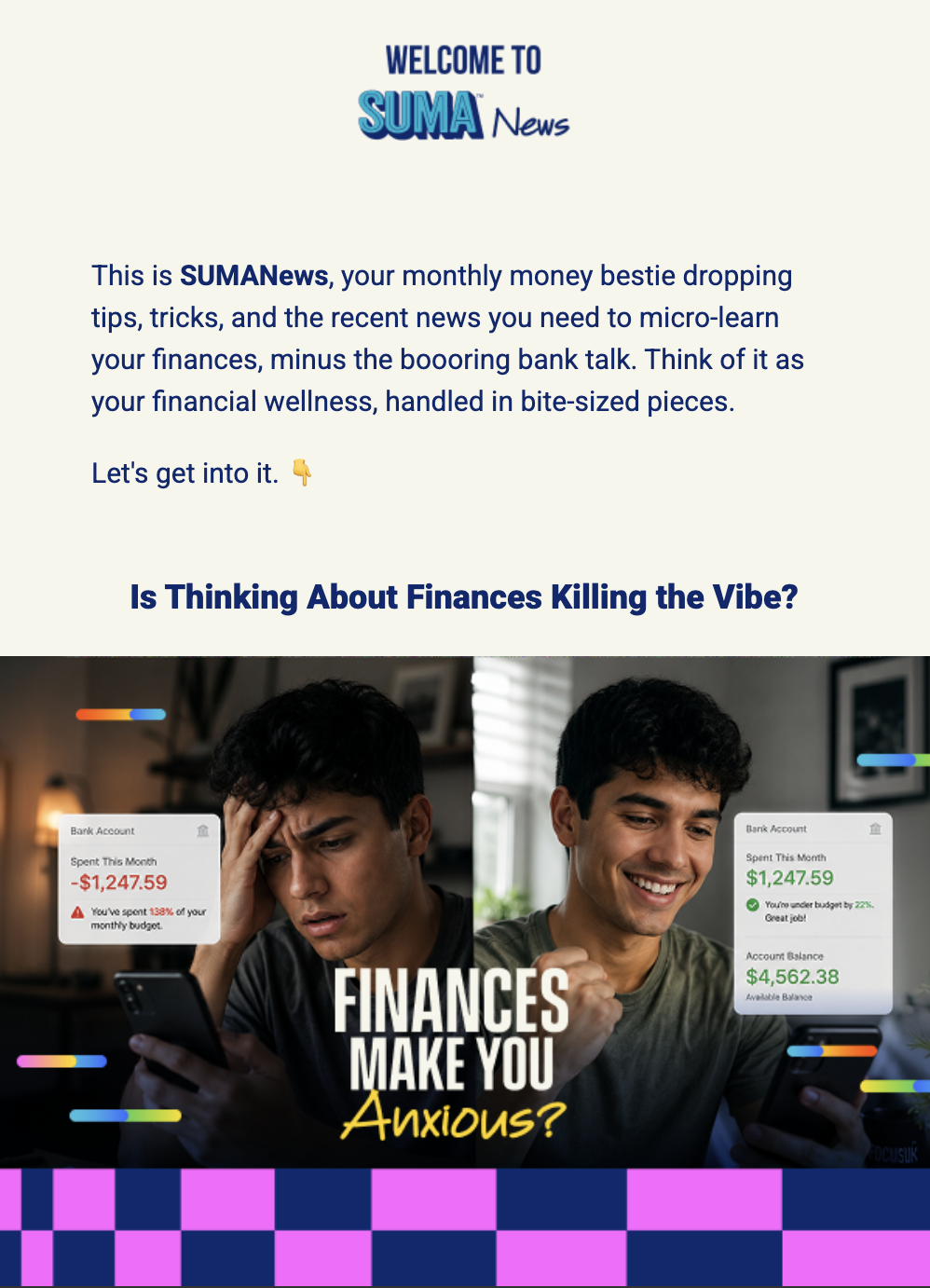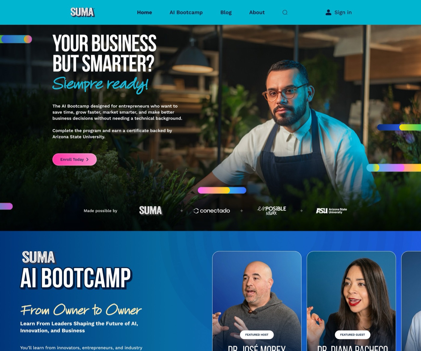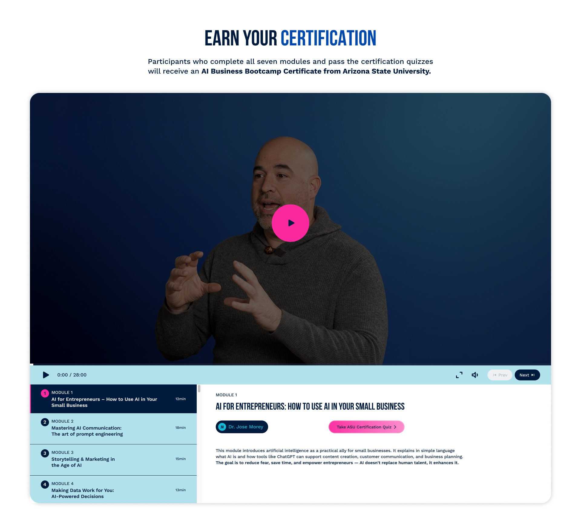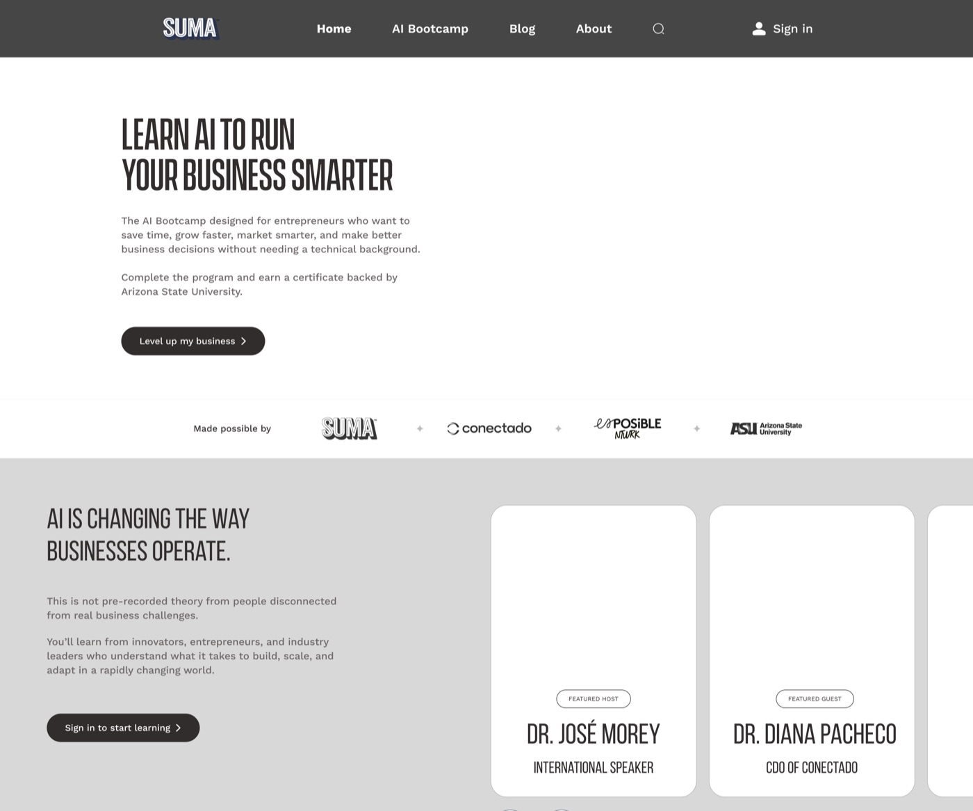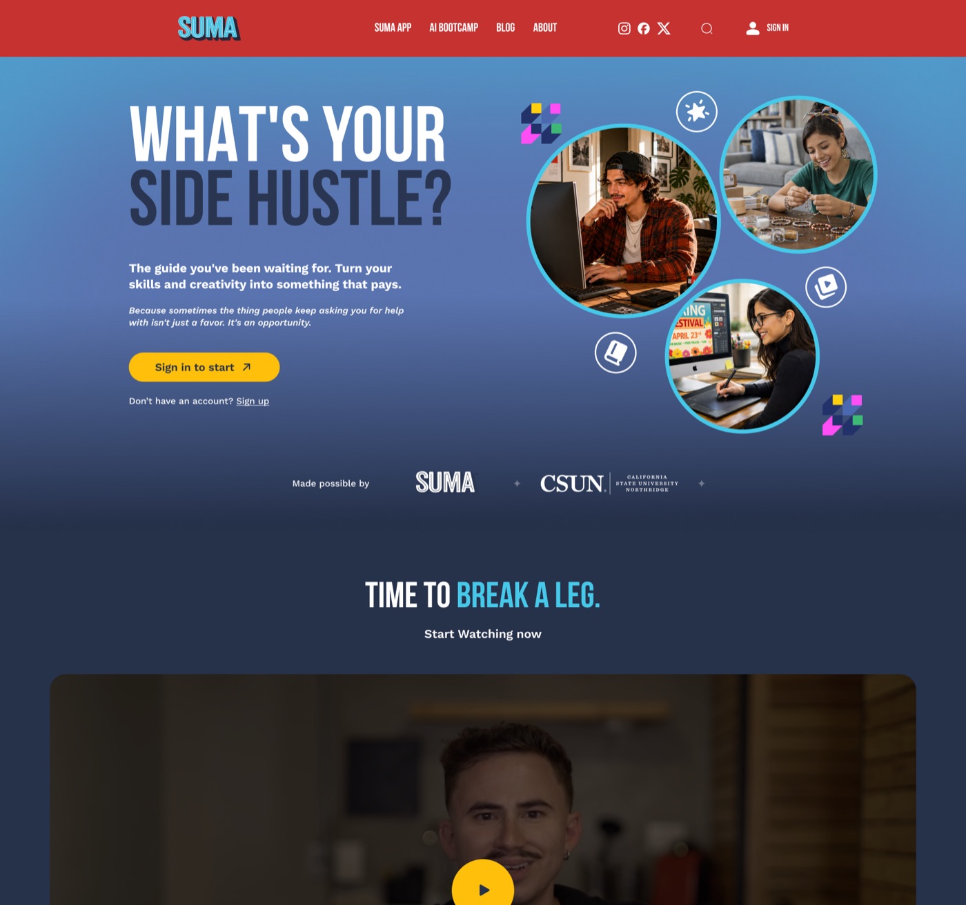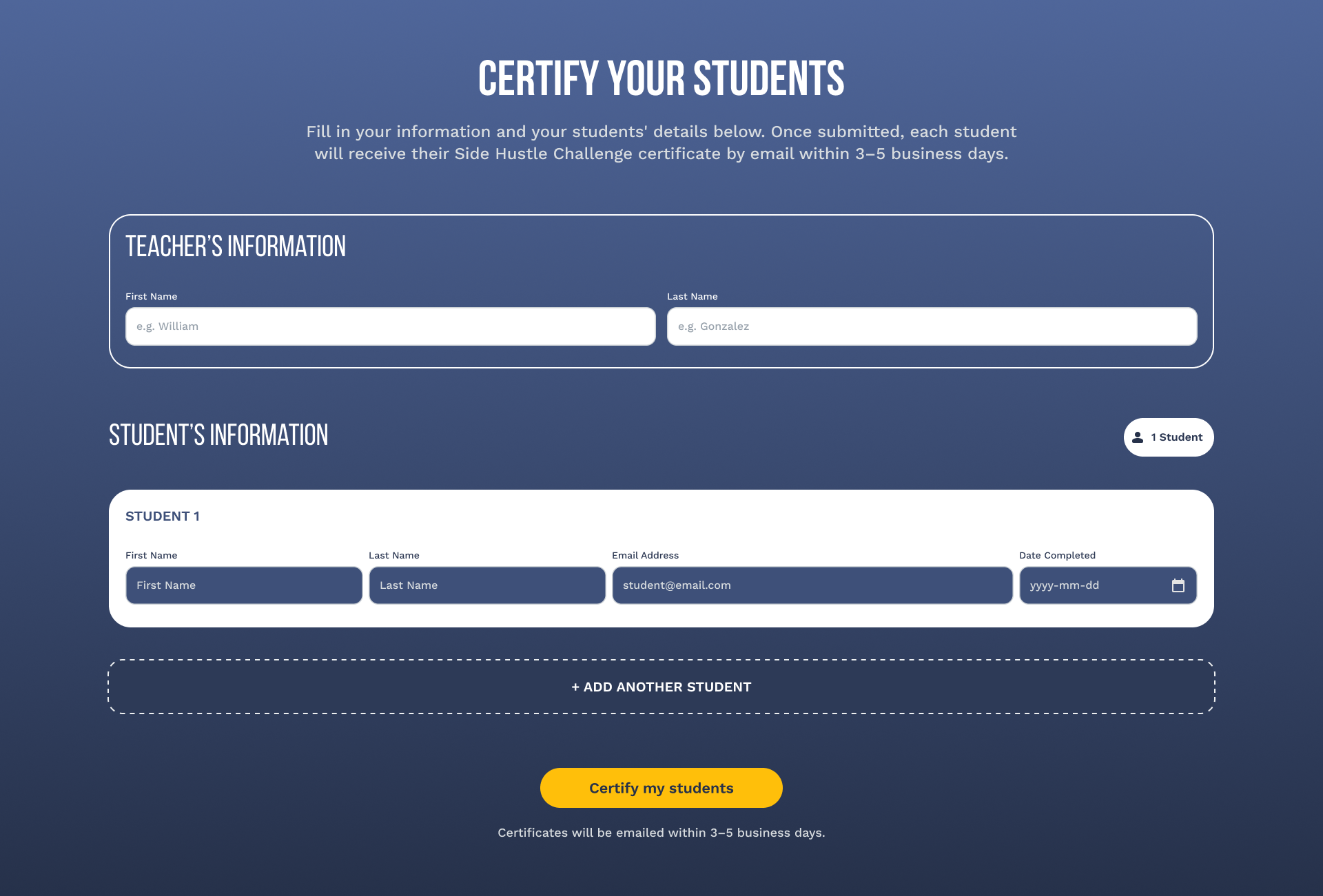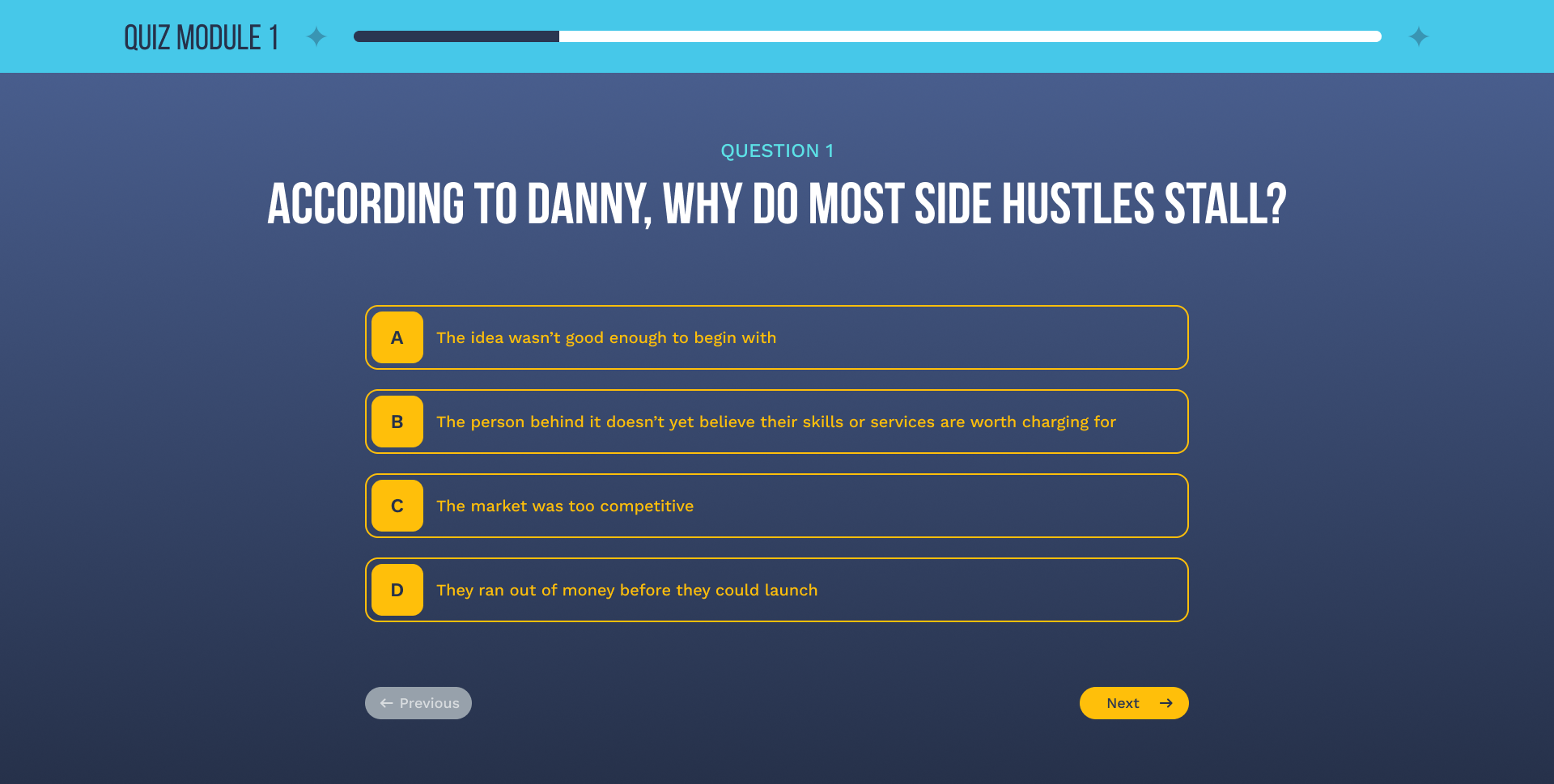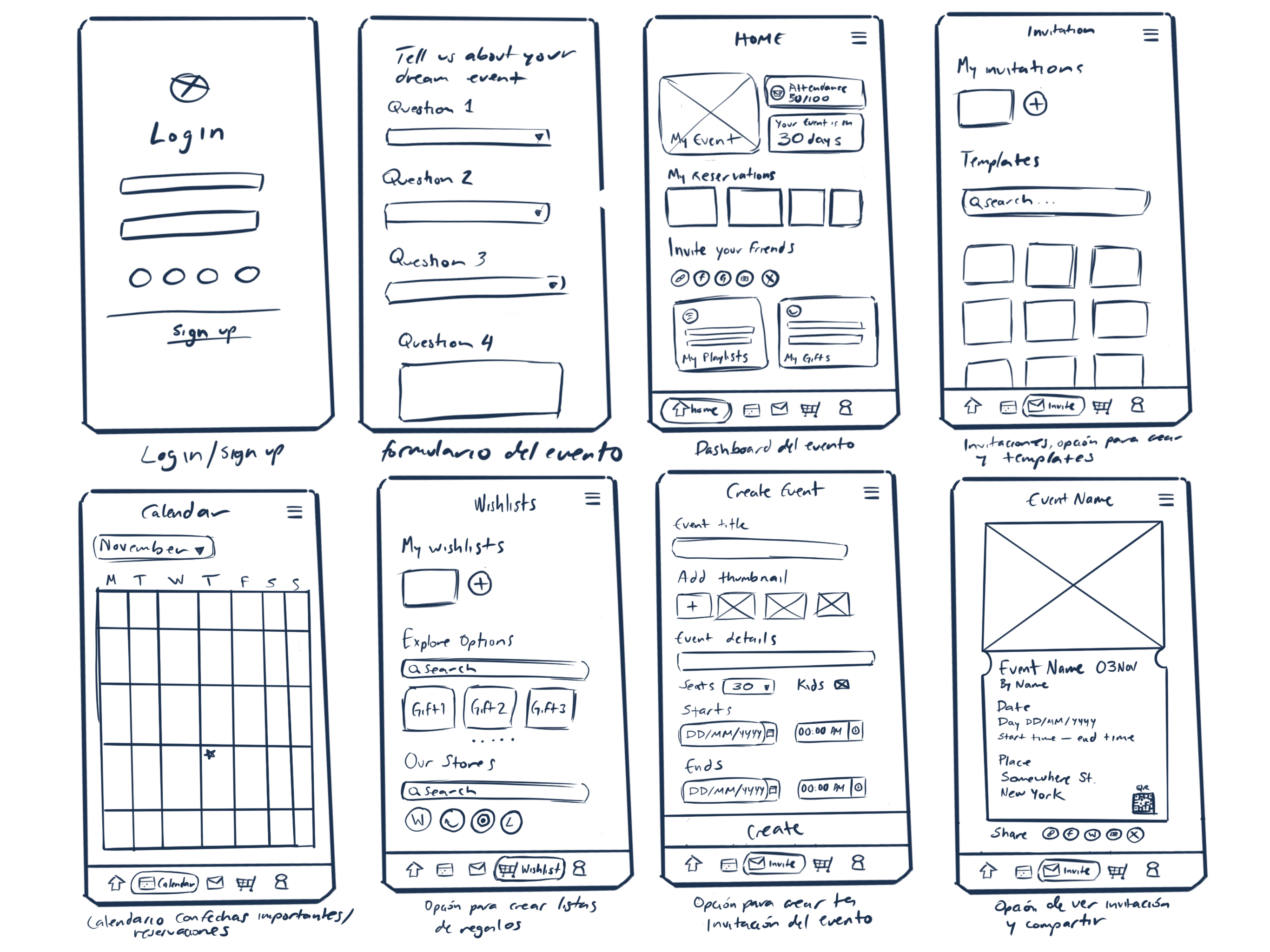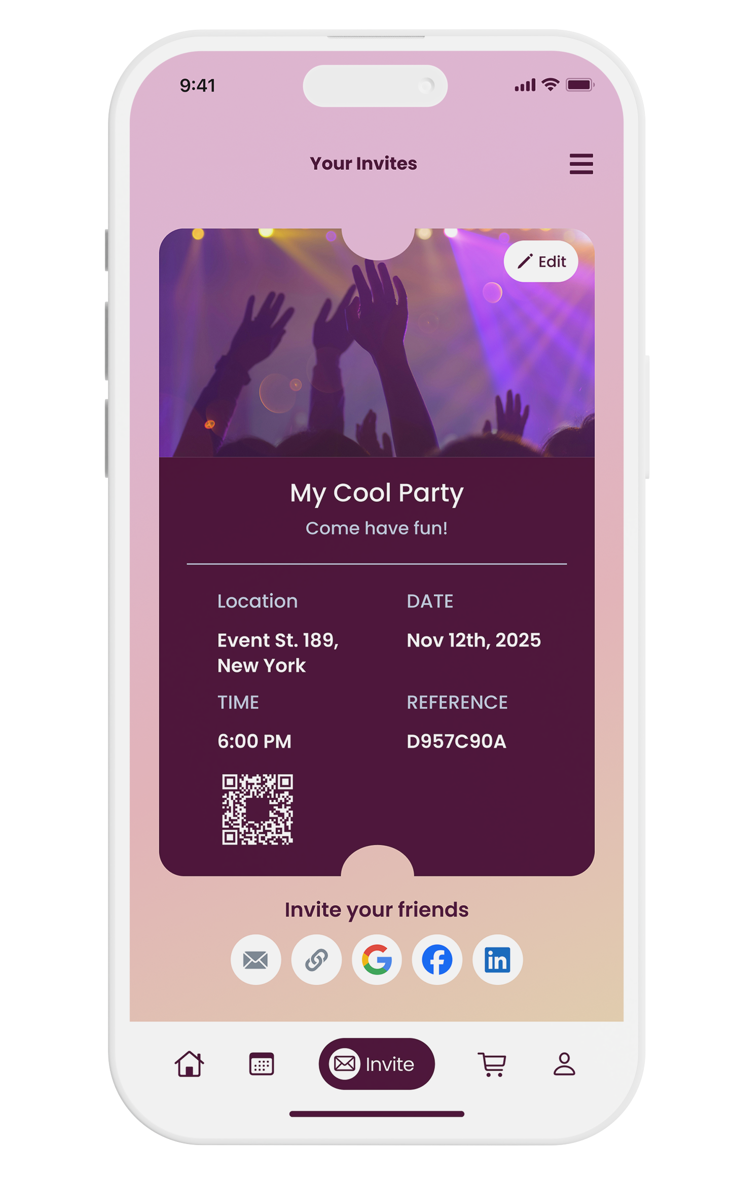
Suma Wealth gives Latinos in the U.S. free financial education and tools. As the sole in-house designer, I rebranded the app's entire visual identity and shipped a native AI financial agent, all while still turning around 80+ other assets a month.
Before
- Web views capped what the app could actually do
- Info cards cluttered every screen
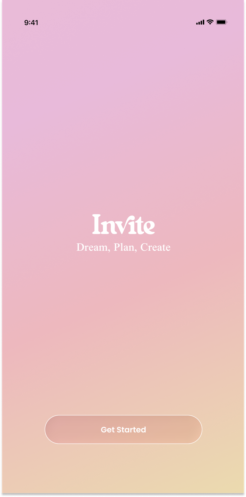
- Oversized logo ate the top of the layout
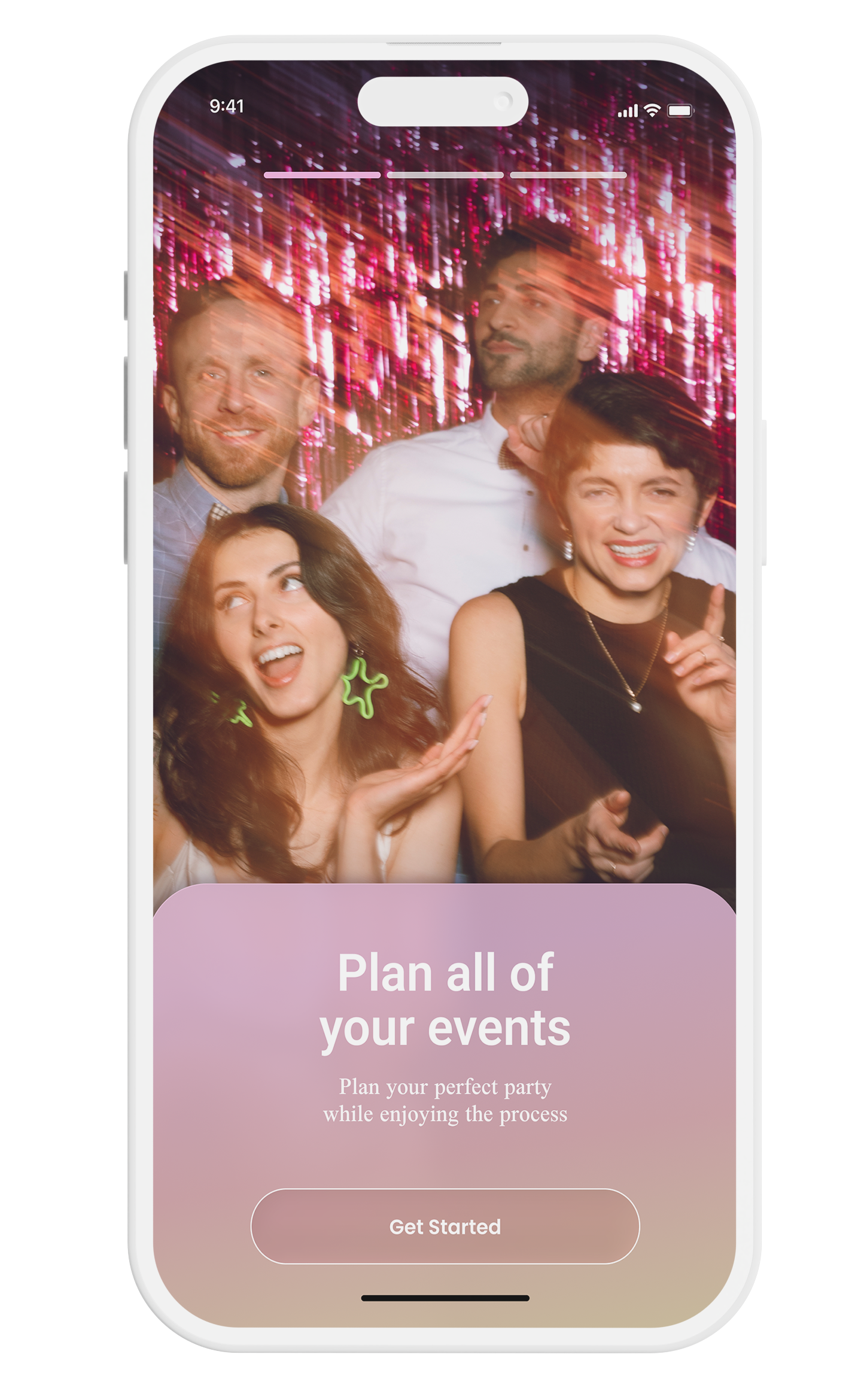
- Visual style felt dated next to competitors
- Navigation flows confused first-time users
After
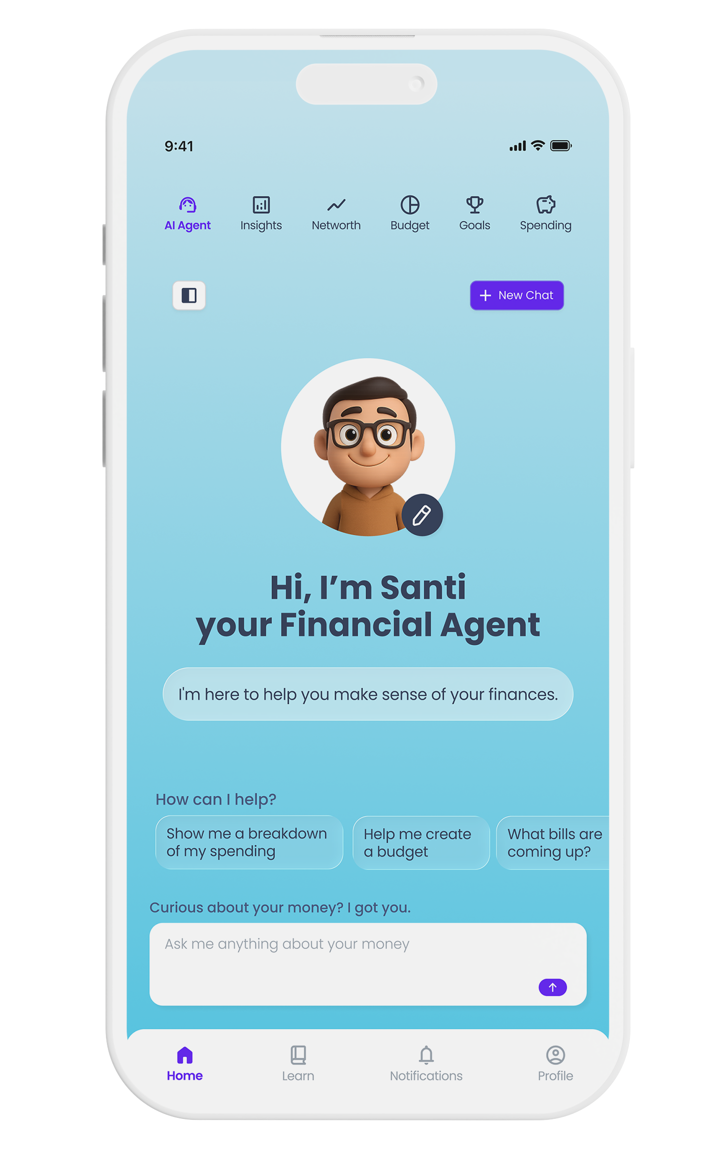
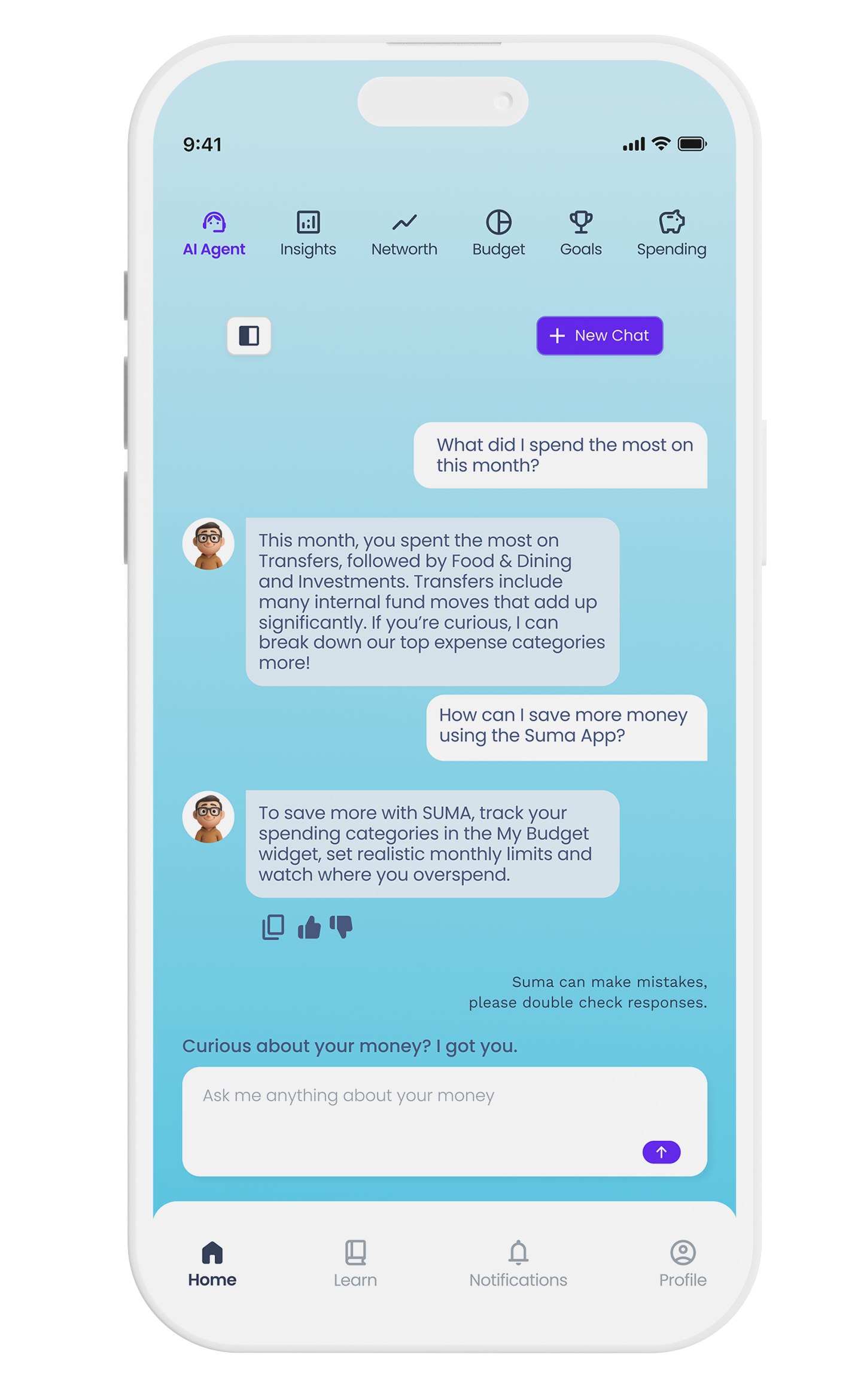
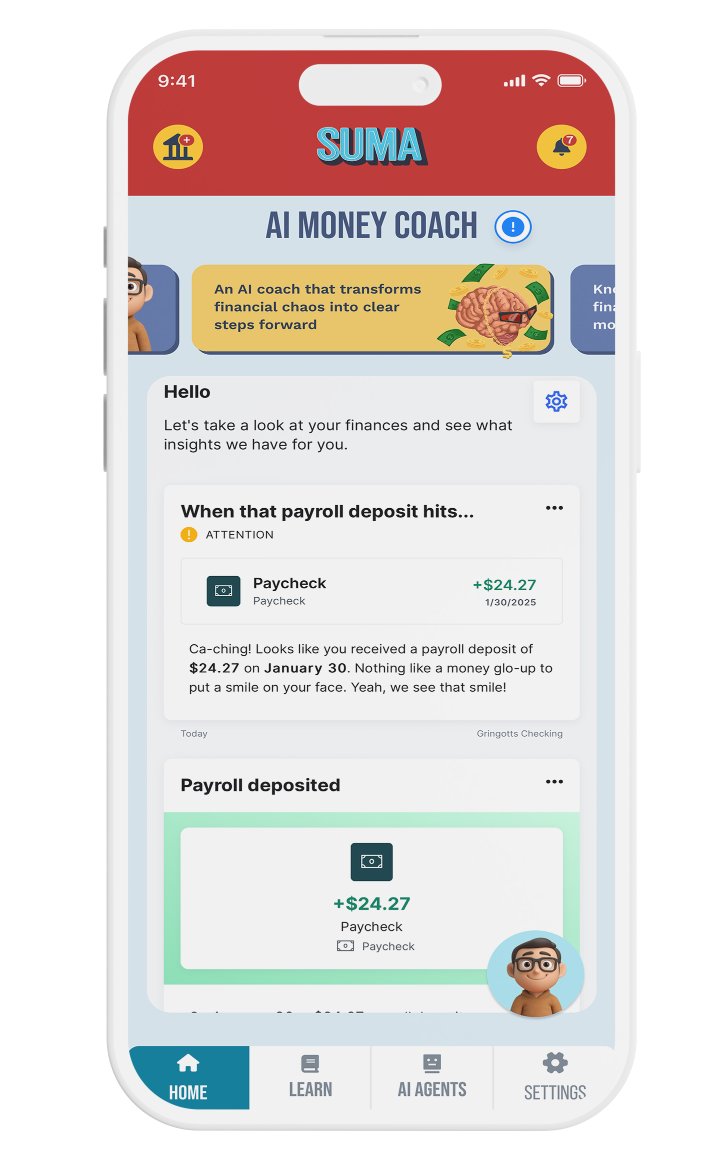
- Native AI financial agent, built in-house
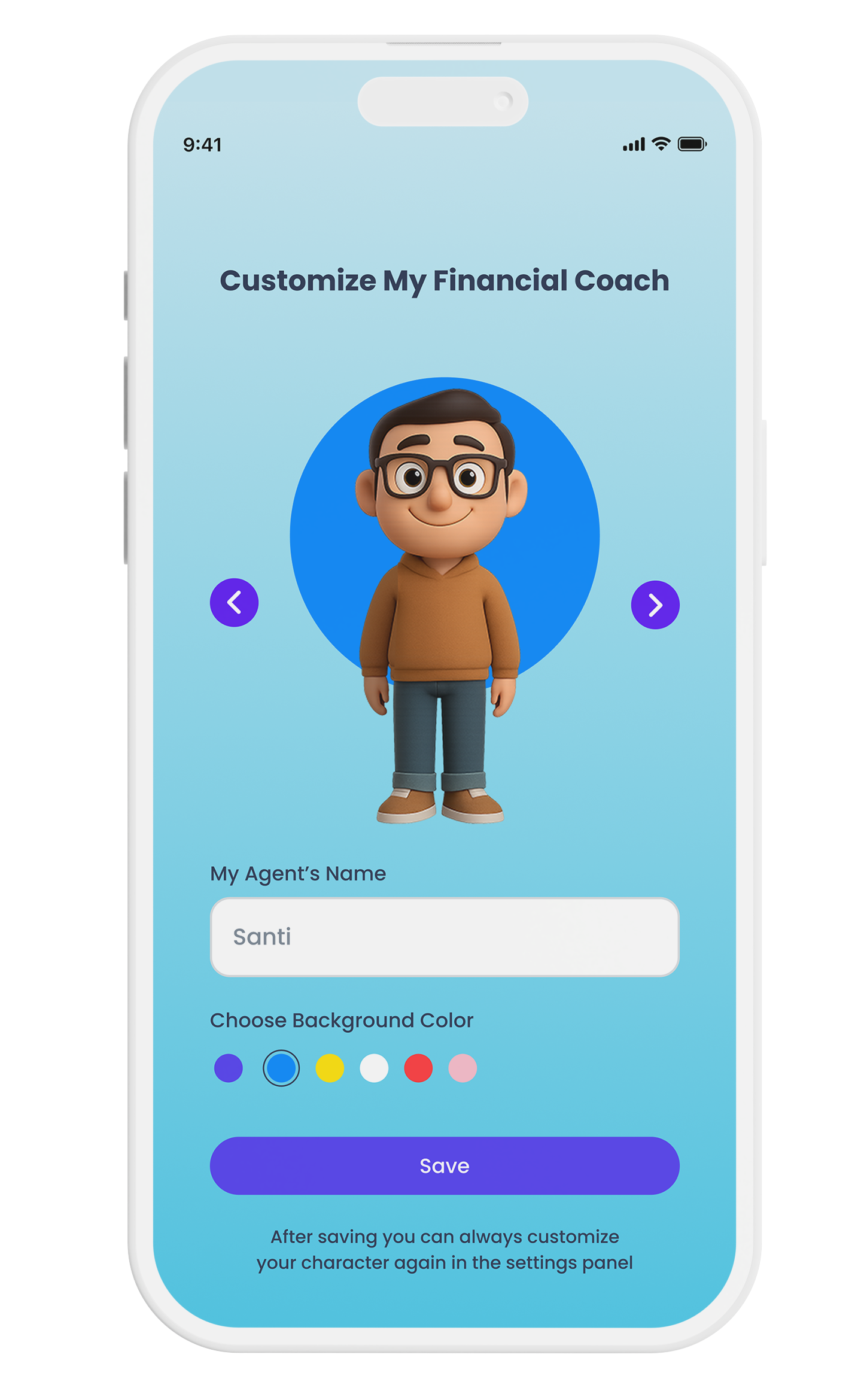
- Agent customization: name, gender, and background color
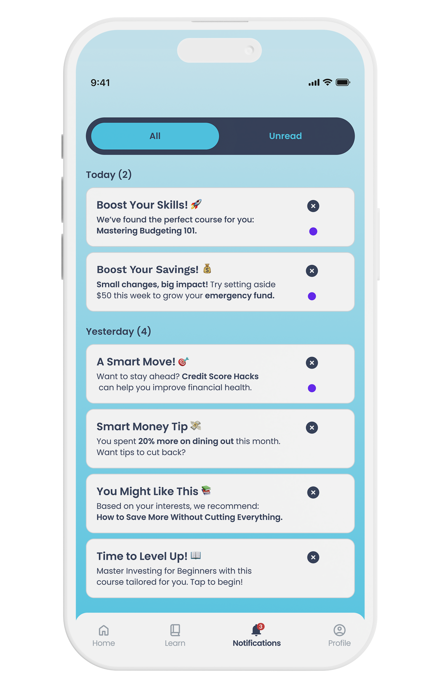
- Rebuilt the component library from scratch (nav, buttons, cards) down to only what's essential
- Reclaimed vertical space across every screen
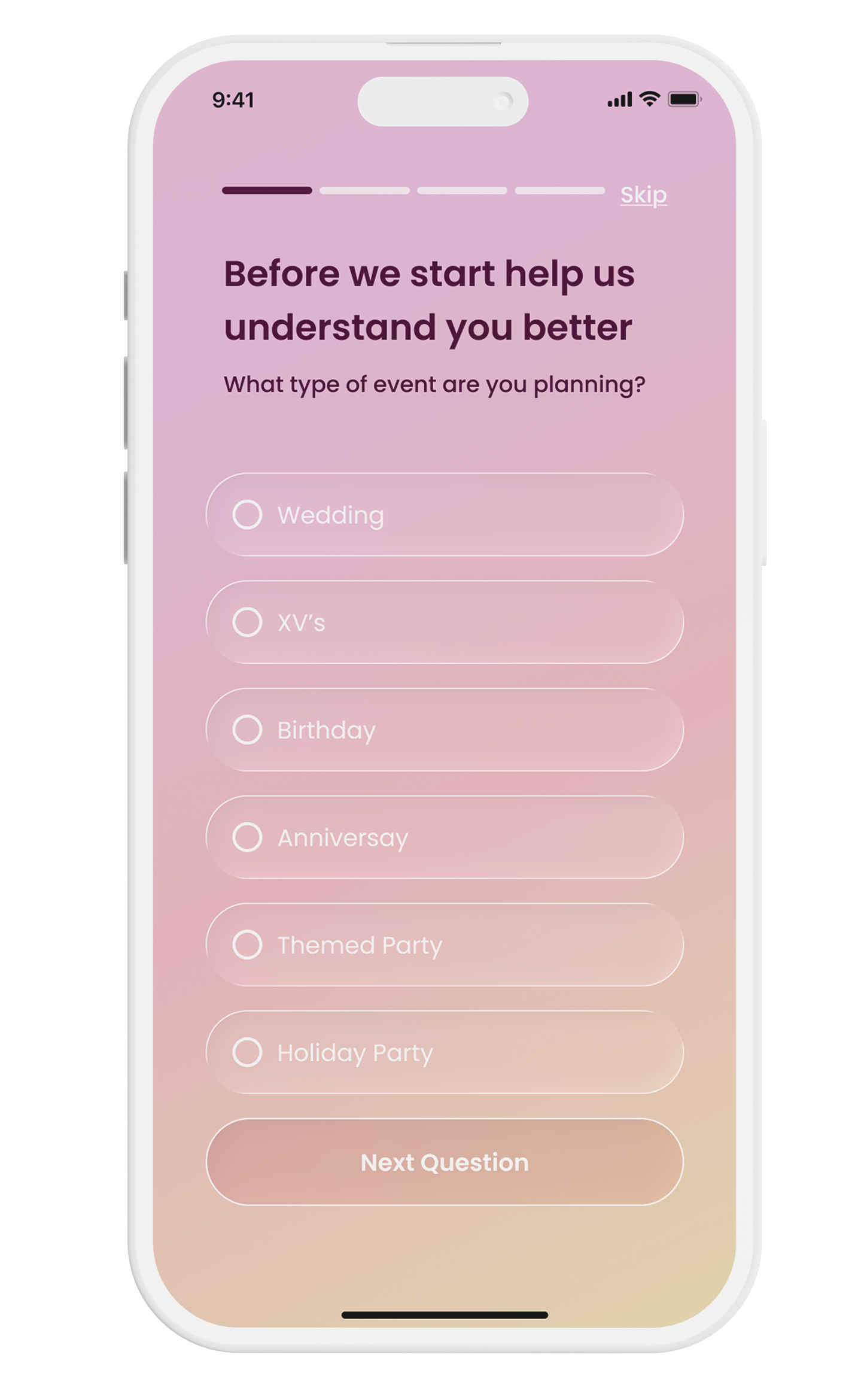
- Cooler, calmer palette, with red removed entirely
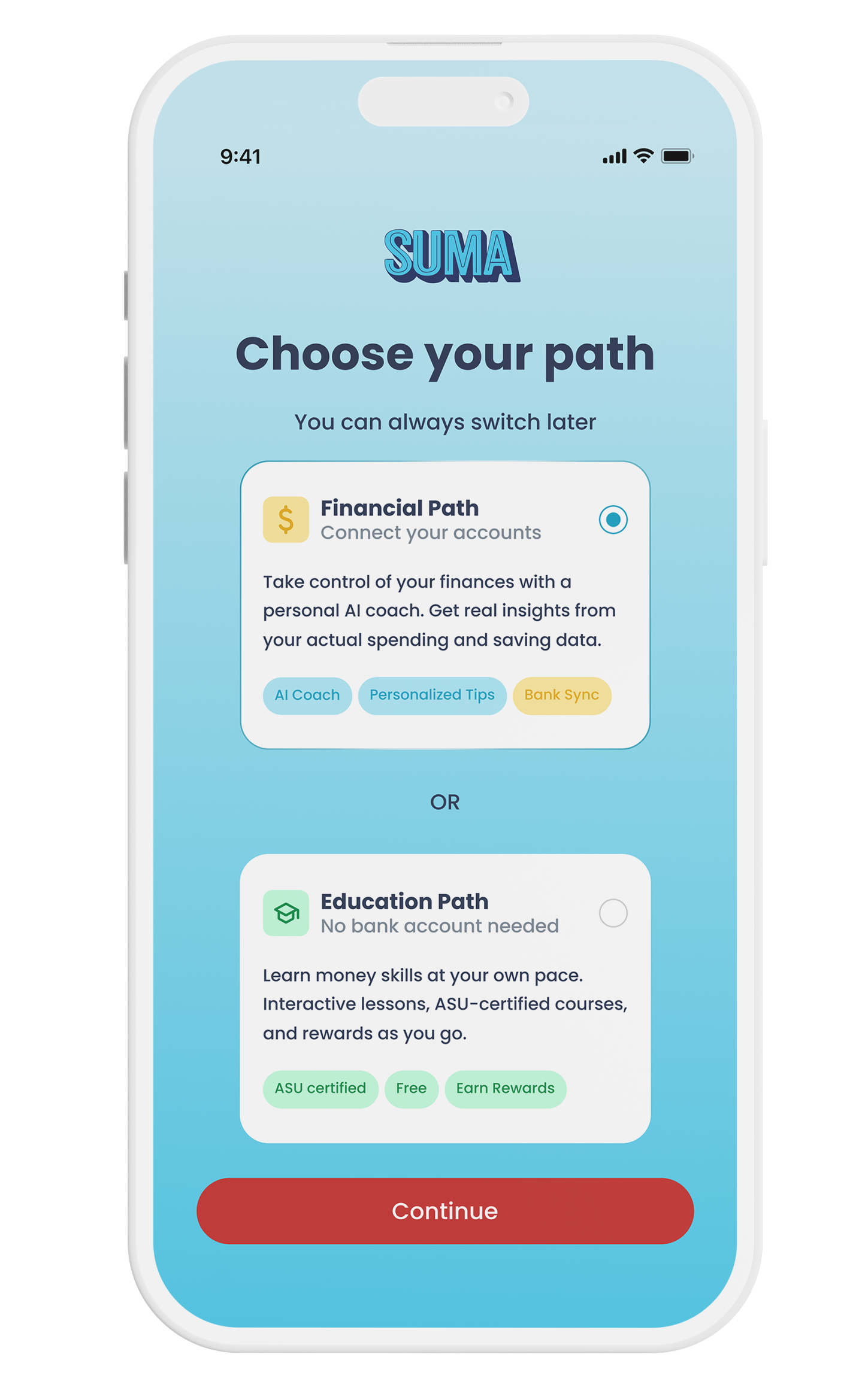
- New onboarding step to pick a free or connected-accounts path
I started with interviews across the existing user base to find where the experience broke down, then mapped the friction from end to end before touching a single screen. I rebuilt the visual system first, with a new palette and a redesigned component library covering navigation, buttons, and cards. Then I validated it with users again before it shipped, instead of assuming the redesign alone would help.
Convincing stakeholders that a visual reset, with no new features, could move engagement. I made the case with interview recordings instead of opinions, then tracked engagement before and after to back it up.
The original brief called for several separate agents, each handling a different task inside the app. Once we weighed that against what users actually needed, it was clear that one agent focused only on finances, the app's core job, would be both cheaper to build and easier for people to trust. I helped make that case, and Suma shipped with a single financial agent instead of a fleet of narrow ones.
To make that one agent feel less like a form and more like a companion, I proposed a customization screen where users name their agent, set its gender, and pick a background color. It was a small, game-like moment, and it shipped with the feature.
Users weren't confused about their money. They were confused by the app. Removing red from the palette and simplifying navigation lowered perceived stress before a single feature changed.
What was made
Beyond the app
The app redesign is one piece of a bigger role. Every week I ship Suma's design out into the world: landing pages, social campaigns, event materials, and sales decks, often for several live projects at once.