Case study 03 · Event planning
Invite App
An event planning app that centralizes invitations, vendor discovery, guest management, and wishlists — turning a fragmented, stressful process into one guided experience. I designed it end to end, from discovery interviews and personas through to a complete UI and a reusable component library.
The problem
A mobile app that centralizes event planning — from invitations and vendor discovery to guest management and wishlists — all in one place. Both professional coordinators and personal hosts face the same core frustration: everything lives in a different tab, and nothing talks to each other.
Personal hosts
- Want a guided, enjoyable planning experience without needing to be experts
- Overwhelmed by the number of decisions and platforms involved
- Onboarding is the biggest friction point — the flow has to reach the first "aha moment" fast
Professional coordinators
- Juggle vendors, guests, and clients across separate, disconnected tools
- Track everything manually in spreadsheets with no single source of truth
- Need consolidation, a rated vendor database, and constant client communication
Discovery interviews
Before designing anything, I ran stakeholder interviews to understand real user needs and validate core feature assumptions. Three questions shaped the direction of the product.
Vendor discovery
Would a vendor database for catering, music, and venue rental be useful?
Guest management
Should guests be able to add a +1, and send that person their own invitation link?
Post-event access
Should the app stay accessible after the event ends, to view photos and memories?
Who we designed for
Two user types emerged from research. Mariana represents the professional coordinator — the more complex, higher-need user whose workflow shaped the app's core architecture.
Pain points
Everything lives in separate tabs · Manual Excel planning tracker · Hard to stay in sync with clients · No single view of event status
Goals
All tools consolidated in one app · Direct, constant client communication · A quality, rated vendor database · A fast, intuitive planning flow
Motivations
Deliver excellent experiences · Save time on logistics · Build lasting client trust
Behaviors
Highly detail-oriented · Prefers direct client contact · Values reliability over features
Affinity mapping
Interview insights were clustered into thematic groups to identify the most critical feature areas to design for.
Attendance
RSVP confirmation · Push notifications · WhatsApp integration · +1 guest links
Invitations
Templates · Animations · QR code · Media attachments · Dress code form
Maps & venue
Live map embed · Floor plan with bathrooms · Reception layout
Gift registry
Wishlist with store links · Direct transfers · Amazon / Target integration
Multimedia
Couple photo gallery · Post-event uploads · Shared playlist
Vendors
Catering DB · Musician DB · Rated & reviewed · Reservation tracking
Calendar
Itinerary sharing · Reminders · Coordinator deadline tracker
Sharing
WhatsApp · Social media · Invite link · Signup flow for guests
From sketches to hi-fi
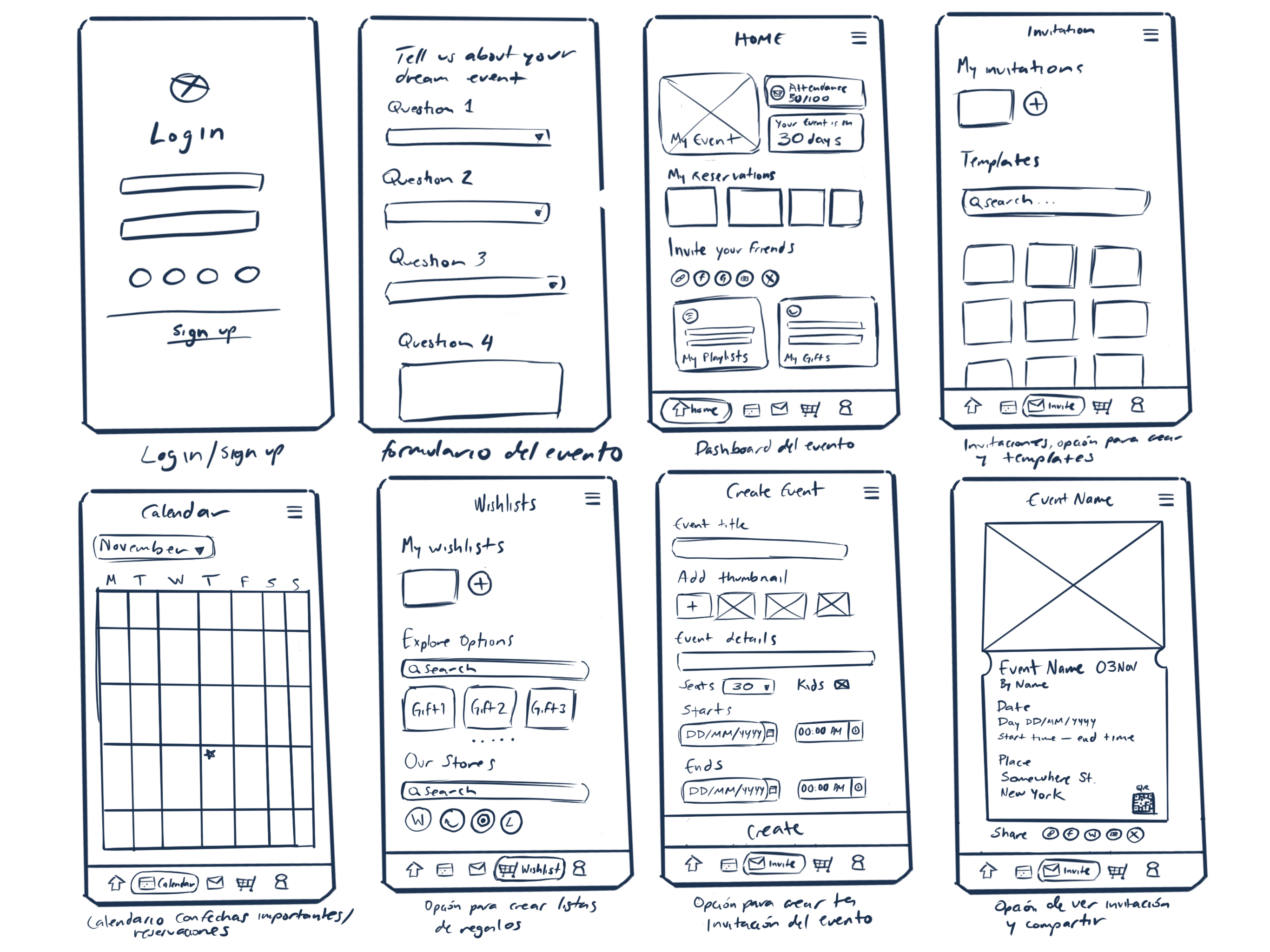
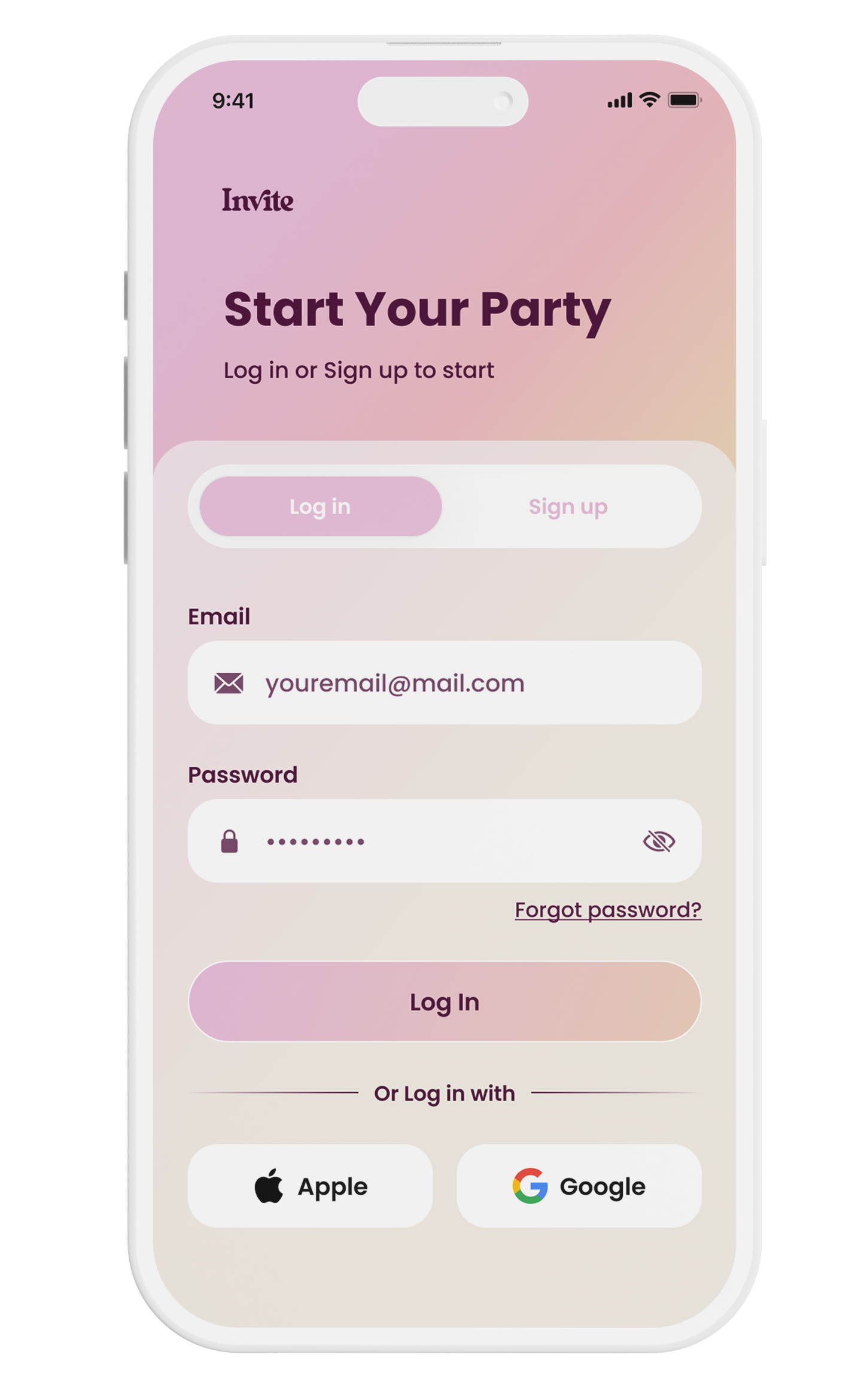
Eight key screens mapped out the information architecture — login, onboarding, dashboard, calendar, invitations, wishlist, and event creation — before any visual decisions were made.
Exploring structure & flow
Hand-drawn screens mapped the core navigation and onboarding quiz, prioritizing information architecture before any visual decisions.
Refining layout & interactions
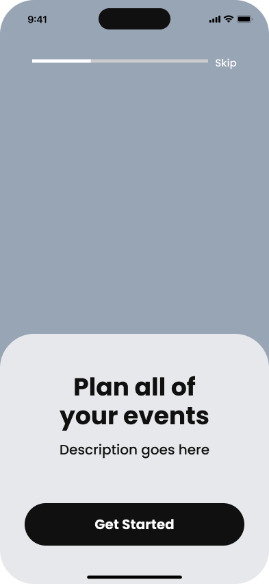
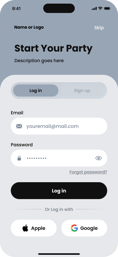
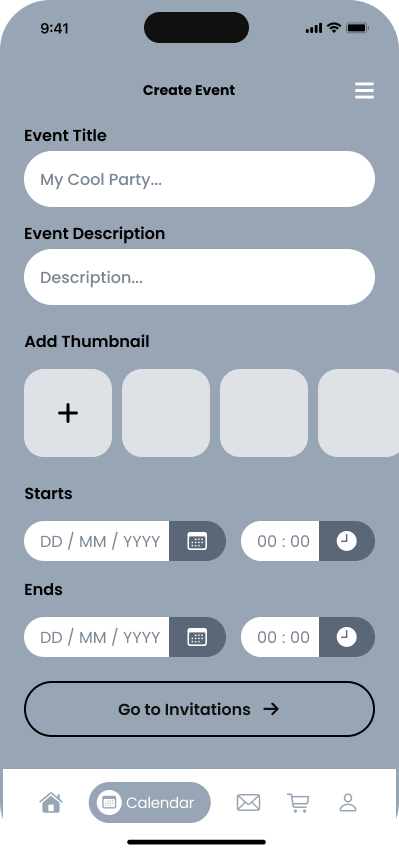
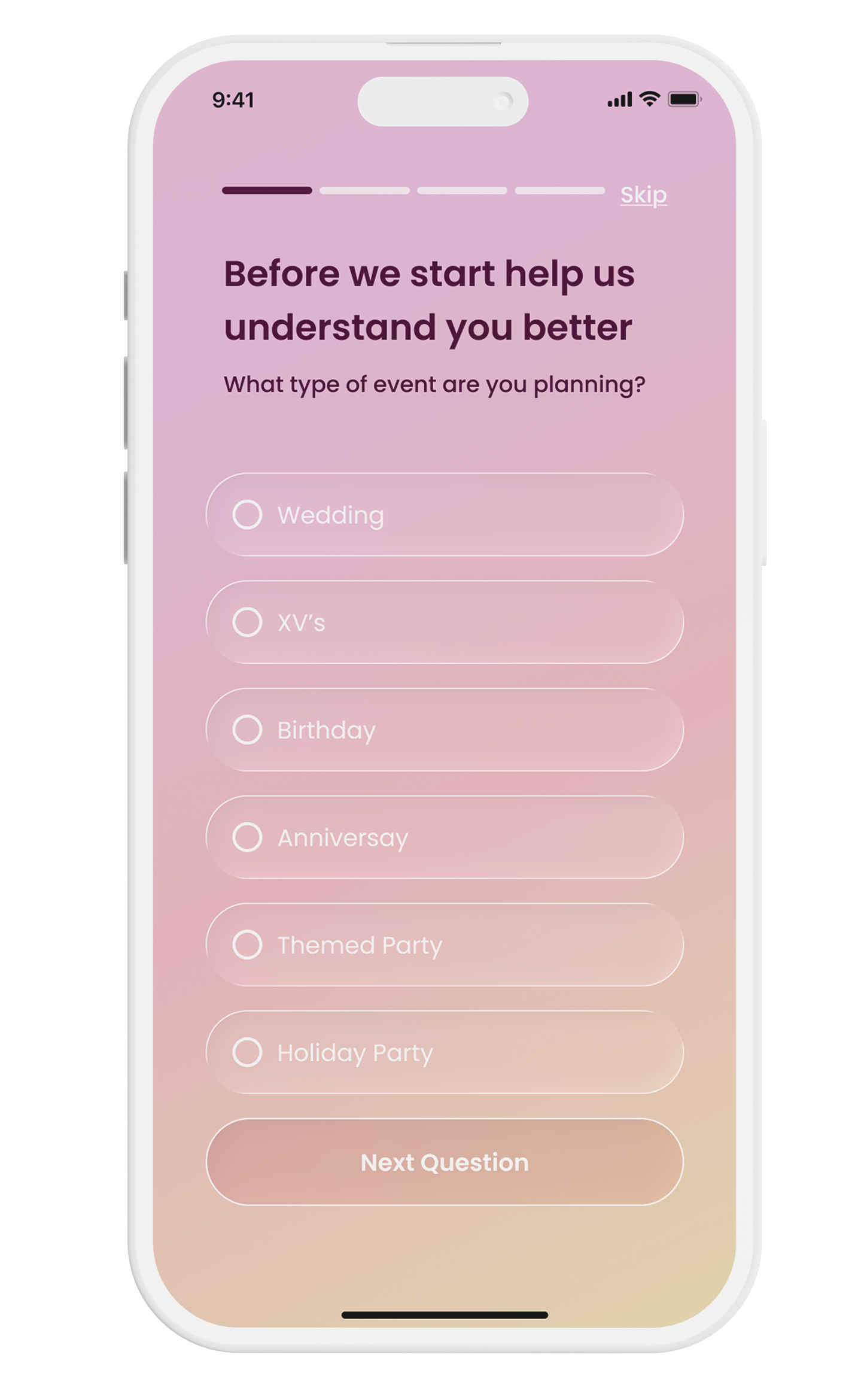
Wireframes were translated into grayscale Figma — tab bar navigation, transitions, onboarding skip logic, and component structure — validating hierarchy and spacing before color.
Visual identity & final screens
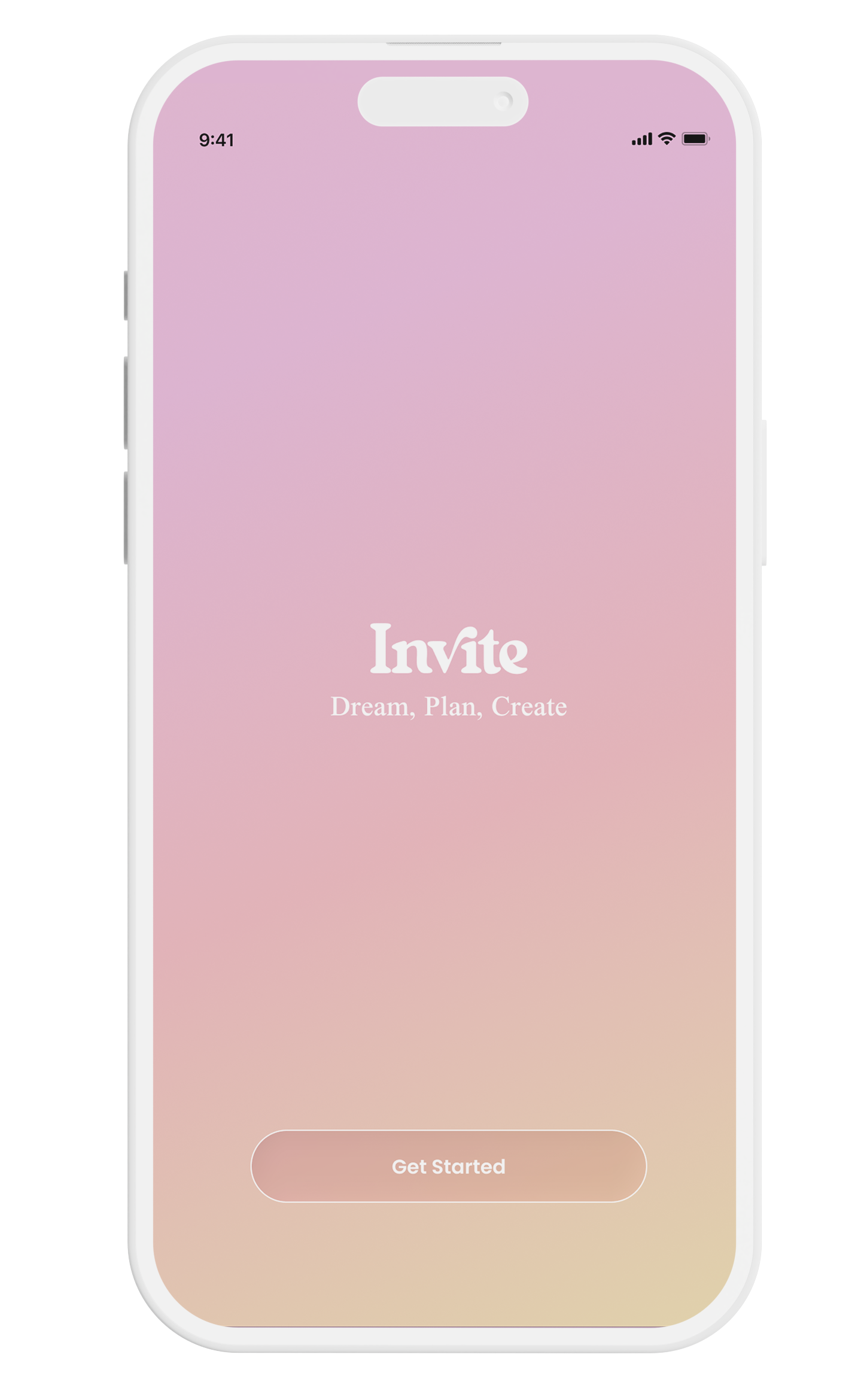
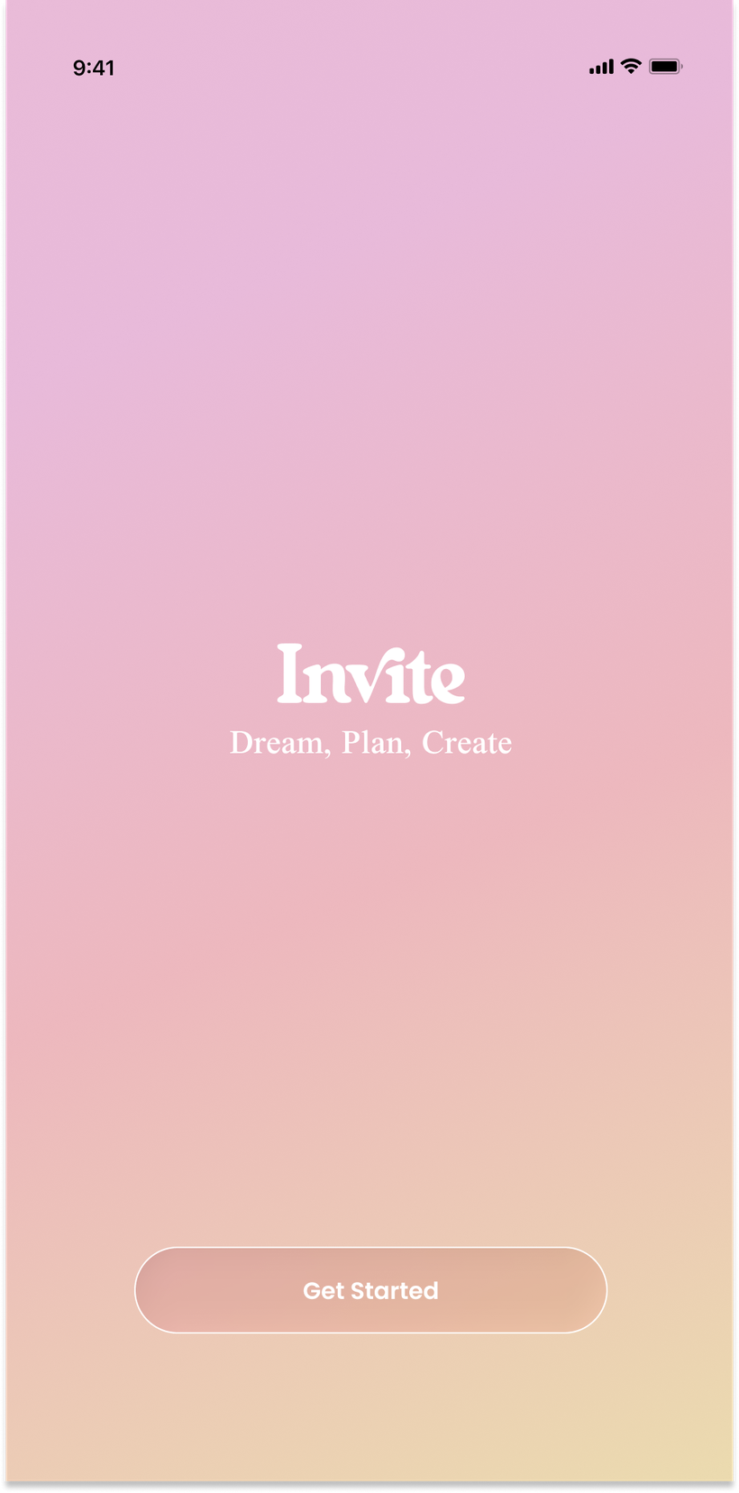
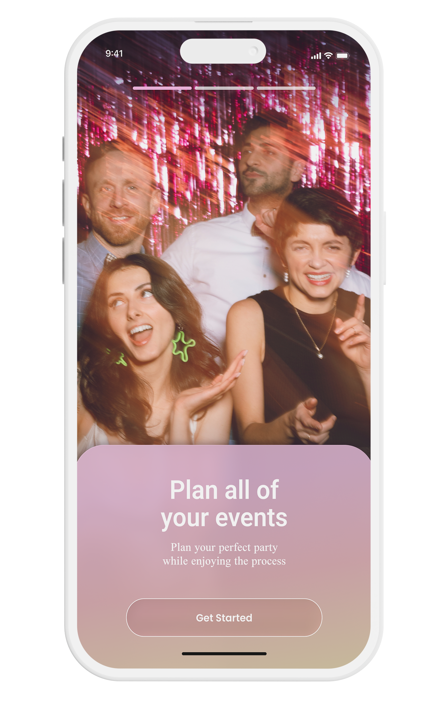
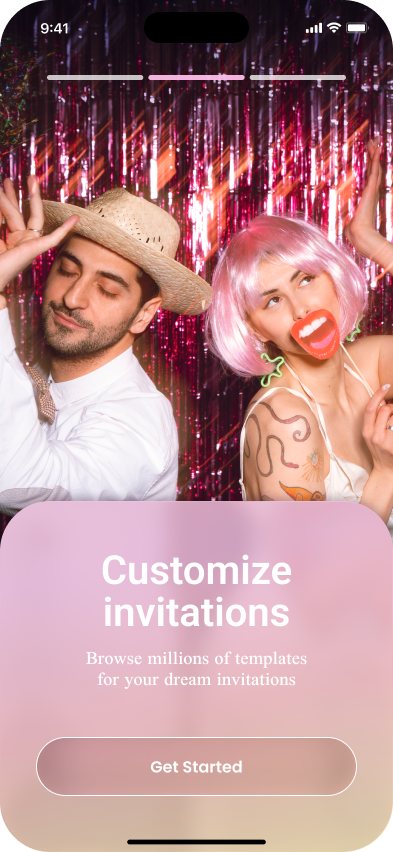
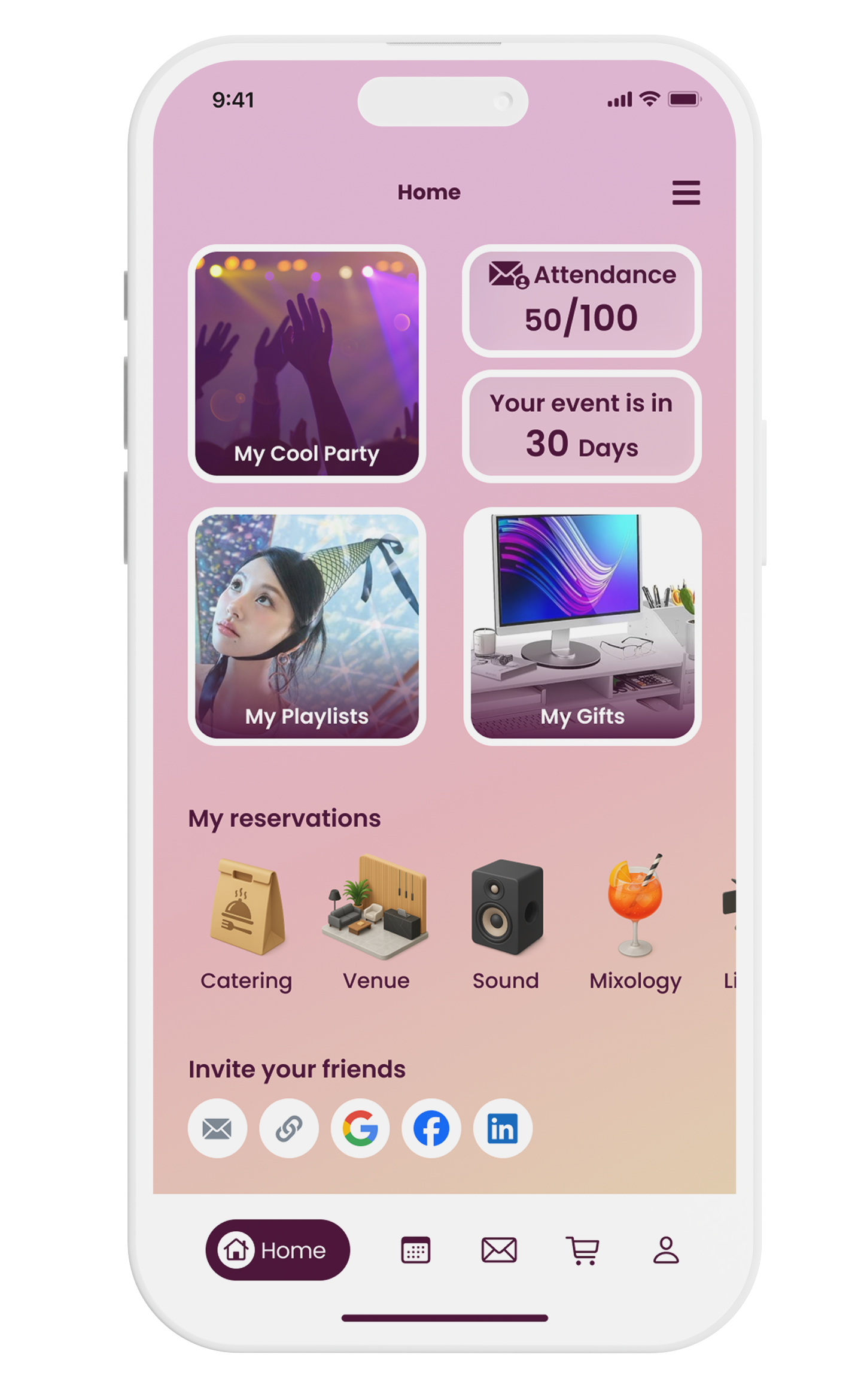
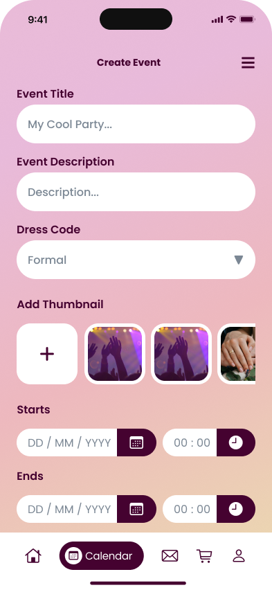
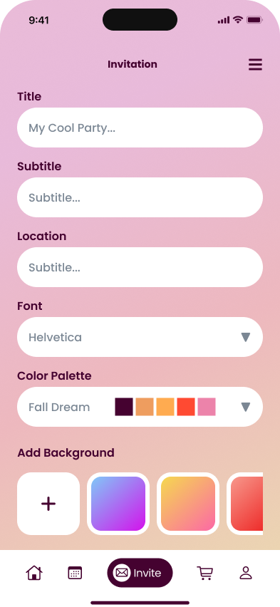
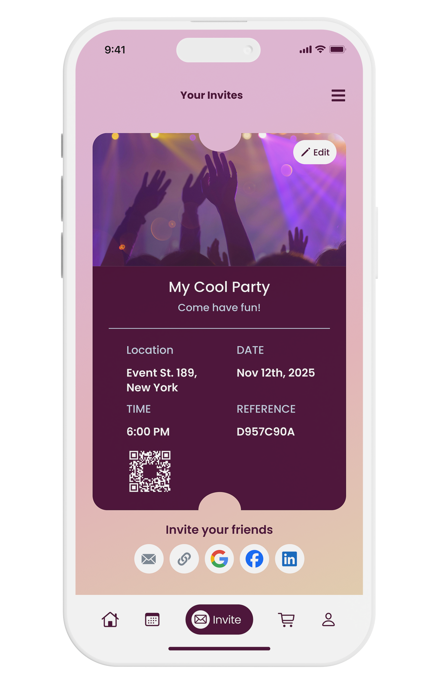
A warm pink-to-peach gradient palette brought the brand to life. Photography, typography, and component styling were finalized across every screen alongside a reusable component library.
Core experience
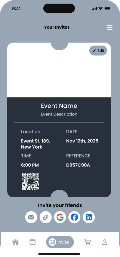
The app's primary flow takes a new user from signup to a fully created, shareable event invitation in six steps.
Key features
Custom invitations
Templates, color palettes, fonts, and QR-code sharing to any platform with built-in RSVP.
Gift wishlist
Wishlists linked to stores like Amazon and Liverpool — guests browse and purchase directly.
Vendor discovery
Browse rated catering, venues, sound, mixology, and lighting services with direct reservations.
Guest management
Real-time attendance tracking, +1 permissions, and push reminders for unconfirmed guests.
Event calendar
Track events, manage important dates, and coordinate deadlines for professional organizers.
Shared playlists
Collaboratively build the event's music playlist, open to guest suggestions or curated by hosts.
Screens
What this demonstrated
Research-driven decisions
Every feature traces back to a validated need from the interview and affinity-mapping phases — nothing was designed on assumption.
Design systems thinking
A reusable component library was built alongside the UI to ensure visual consistency and scalability.
Dual user model
The onboarding quiz intelligently separates personal hosts from professional coordinators, adapting the experience for each.