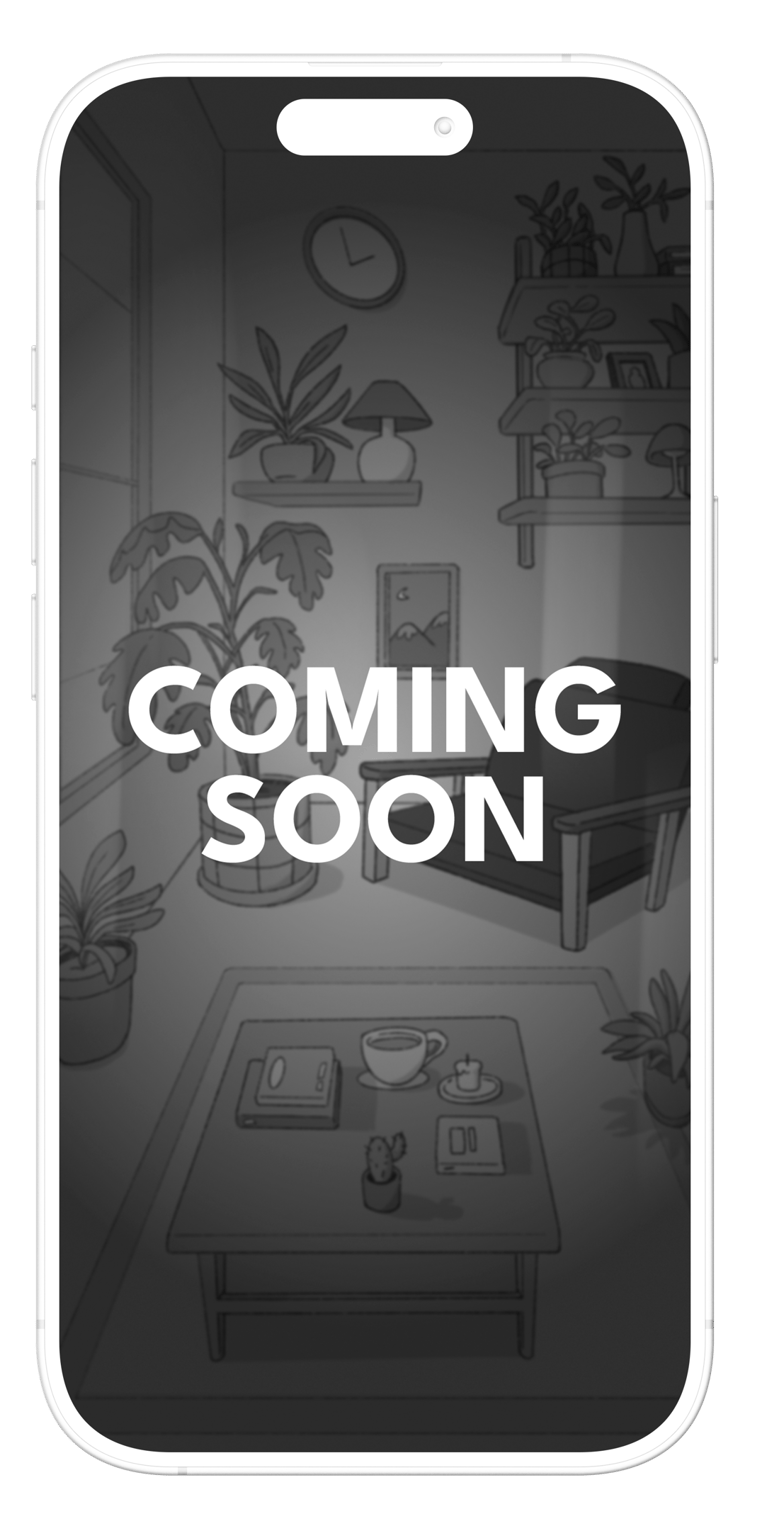
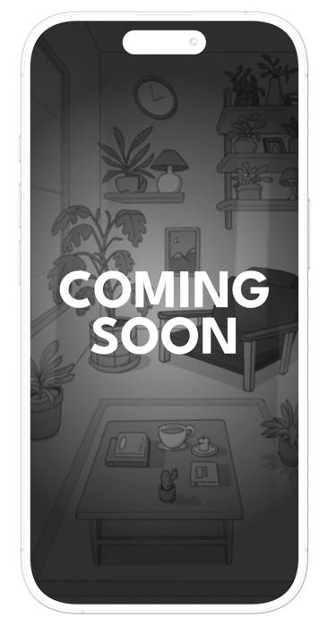
A cozy meditation game where stillness is rewarded. Sit and breathe in a soft, sunlit room. The more you meditate, the more your plants grow. Earn credits for daily sessions and spend them on plants and decorations to make your space your own.

SUNNYDAY
App Design & Illustration
ROLE
UX Research · UI Design
SCOPE
End-to-end design
PLATFORM
iOS · Mobile
TOOLS
Figma, Procreate, Photoshop

GAME CONCEPT
OVERVIEW
Daily meditation sessions are the core loop. The longer you sit, the more your plants grow in real time.
Meditate to progress
Living plants
Plants grow based on your meditation streak. Miss a day and they need care. Consistent practice keeps them thriving.
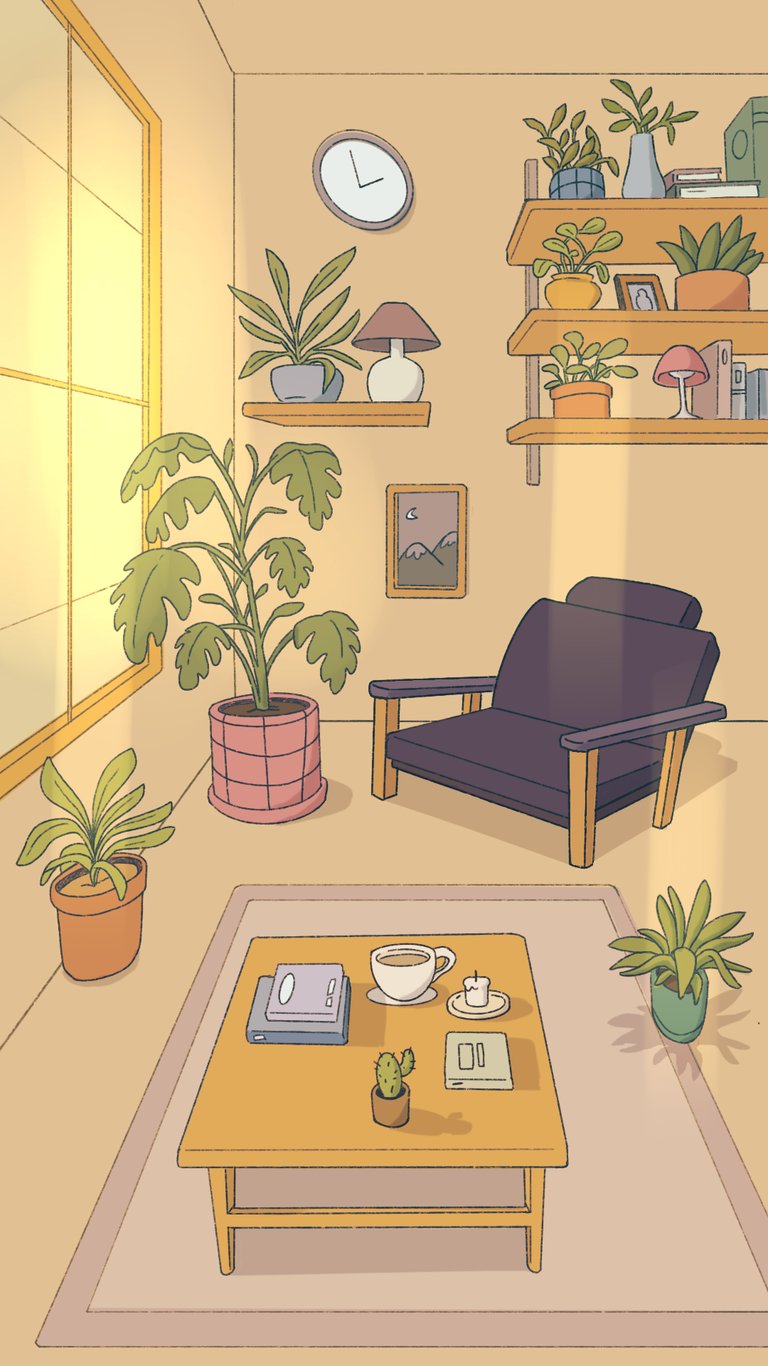
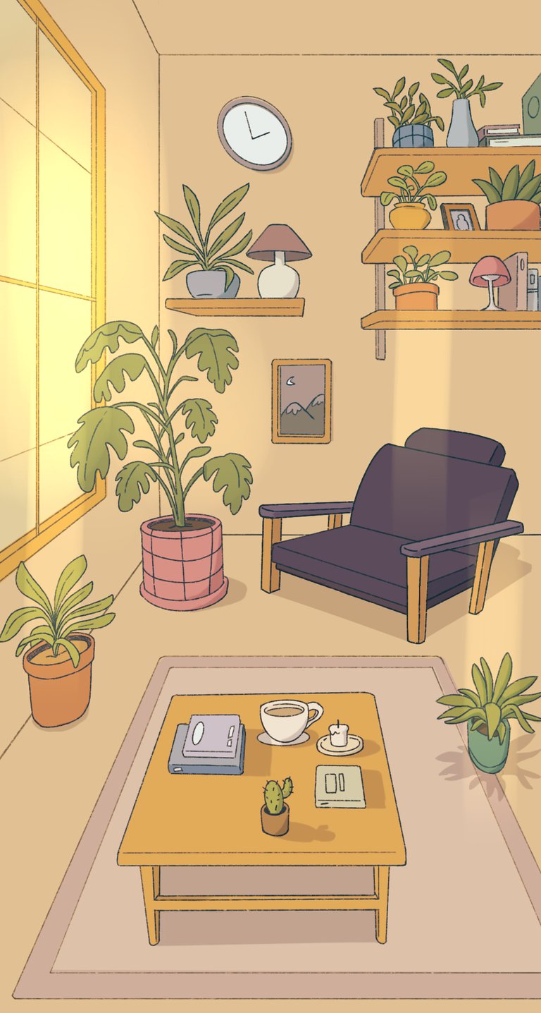
Your cozy room
Spend credits on new plants, pots, furniture, and ambient music to personalize your meditation space.
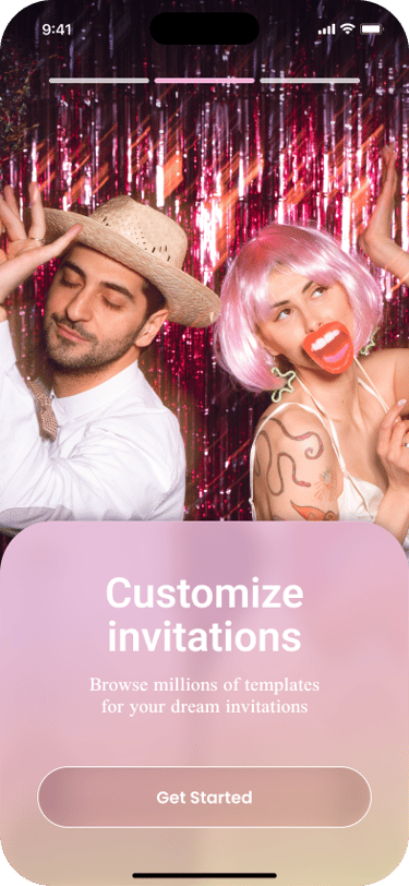
Concept & art direction
DESIGN PROCESS
Soft pastel palette, Ghibli-inspired warmth, cozy interior world-building
Illustrations
Characters, plants, room objects, and decor — all hand-crafted assets
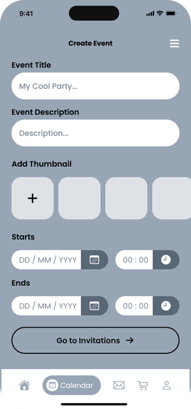
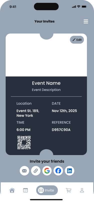
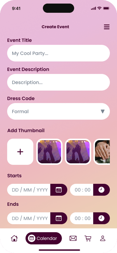
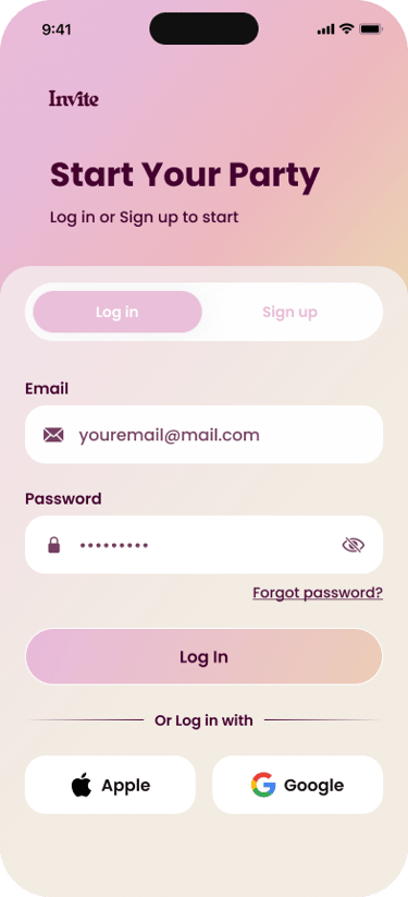
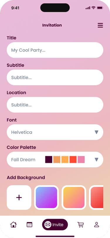
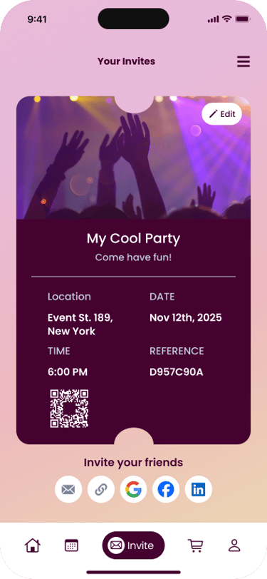
The app's primary flow takes a new user from signup to a fully created, shareable event invitation in six steps.
UI components & logo
Full component library, typography system, and brand mark
Figma wireframes
UX flows for meditation, shop, onboarding, and room customization
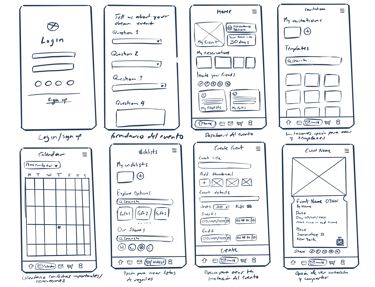
SKETCHES TO HI-FI
The design went through three distinct stages, each building on insights from the previous.
DESIGN PROCESS
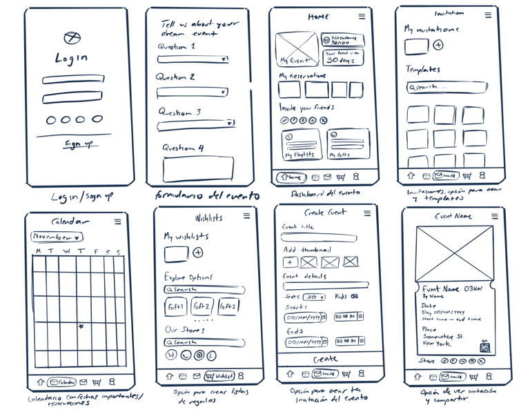
Hand-drawn screens mapped out the core navigation: login, onboarding quiz, event dashboard, calendar, invitations, wishlist, and event creation.
These lo-fi sketches prioritized getting the information architecture right before any visual decisions were made.
Exploring structure and flow
Refining layout and interactions
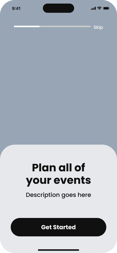
Wireframes were translated into Figma with grayscale fidelity, establishing the tab bar navigation, screen transitions, onboarding flow with skip logic, and component structure.
At this stage, content hierarchy and spacing were validated before any color was applied.
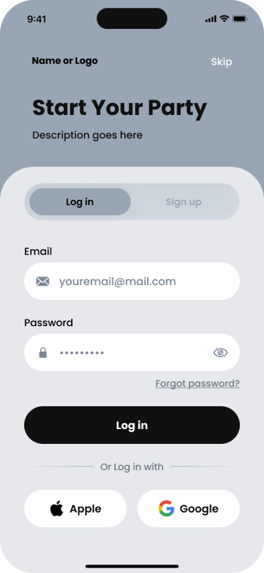
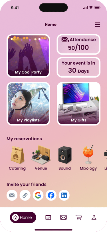
Visual identity and final screens
A warm pink-to-peach gradient palette was applied to bring the brand to life. Photography, typography, and component styling were finalized across all screens, including the complete onboarding experience and a reusable component library.


SO DO YOU LIKE MY STUFF?

Contact me for full-time, freelance oportunities or just to say a few nice words, I won’t mind at all.