An event planning app that centralizes invitations, vendor discovery, guest management, and wishlists — turning a fragmented, stressful process into one guided experience.


IVITE
App Design
ROLE
UX Research · UI Design
SCOPE
End-to-end design
PLATFORM
iOS · Mobile
TOOLS
Figma, Figjam
THE PROBLEM
A mobile app that centralizes event planning — from invitations and vendor discovery to guest management and wishlists — all in one place.
OVERVIEW
Both professional coordinators and personal hosts face the same core frustration: everything lives in a different tab, and nothing talks to each other.
Personal Hosts
Want a guided, enjoyable planning experience without needing to be experts. Overwhelmed by the number of decisions and platforms involved.
Onboarding is our biggest friction point with users. Simplifying the flow to reduce drop-off and get users to their first "aha moment" faster.
Professional Coordinators
DISCOVERY INTERVIEWS
Before designing anything, stakeholder interviews were conducted to understand real user needs and validate core feature assumptions.
Key questions explored:
RESEARCH
Interview question — vendor discovery
Would a vendor database for catering, music, and venue rental be useful?
Should guests be able to add a +1, and send that person their own invitation link?
Interview question — guest management
Should the app stay accessible after the event ends, to view photos and memories?
Interview question — post-event access
SKETCHES TO HI-FI
The design went through three distinct stages, each building on insights from the previous.
DESIGN PROCESS
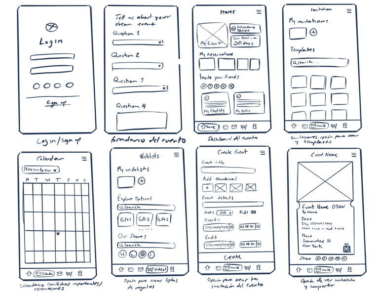
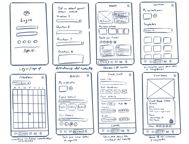
Hand-drawn screens mapped out the core navigation: login, onboarding quiz, event dashboard, calendar, invitations, wishlist, and event creation.
These lo-fi sketches prioritized getting the information architecture right before any visual decisions were made.
Exploring structure and flow
Refining layout and interactions
Wireframes were translated into Figma with grayscale fidelity, establishing the tab bar navigation, screen transitions, onboarding flow with skip logic, and component structure.
At this stage, content hierarchy and spacing were validated before any color was applied.
Visual identity and final screens
A warm pink-to-peach gradient palette was applied to bring the brand to life. Photography, typography, and component styling were finalized across all screens, including the complete onboarding experience and a reusable component library.


Onboarding
CORE EXPERIENCE
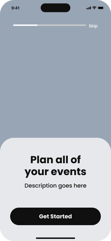
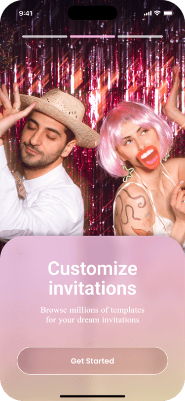
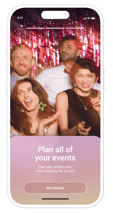
Splash screens introduce the three core value props
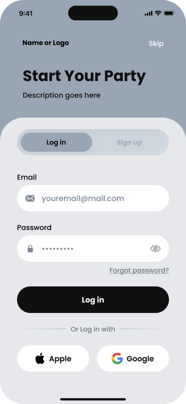
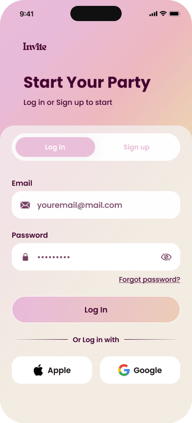
Auth
Log in or sign up via email or Apple/Google
Quiz
Personalization questions: event type, services, restrictions
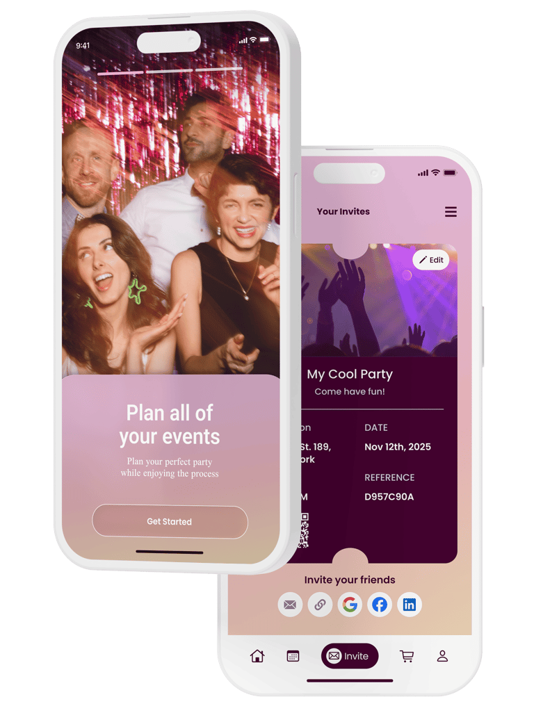
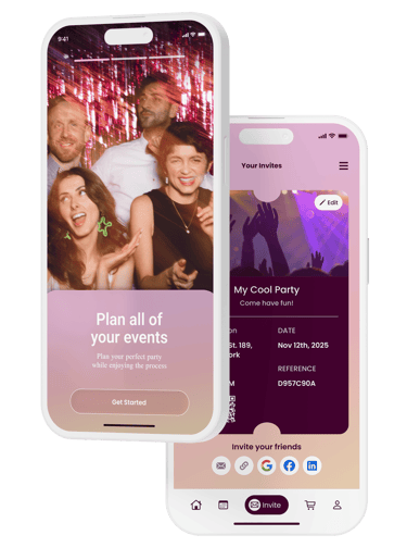
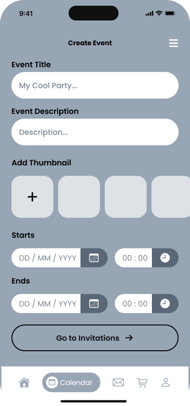
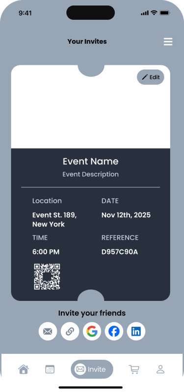
The app's primary flow takes a new user from signup to a fully created, shareable event invitation in six steps.
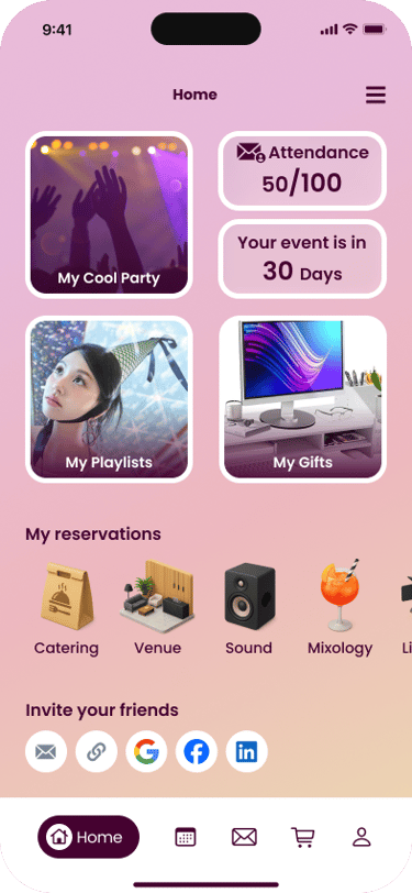
Dashboard
Central hub with countdown, attendance, and quick access
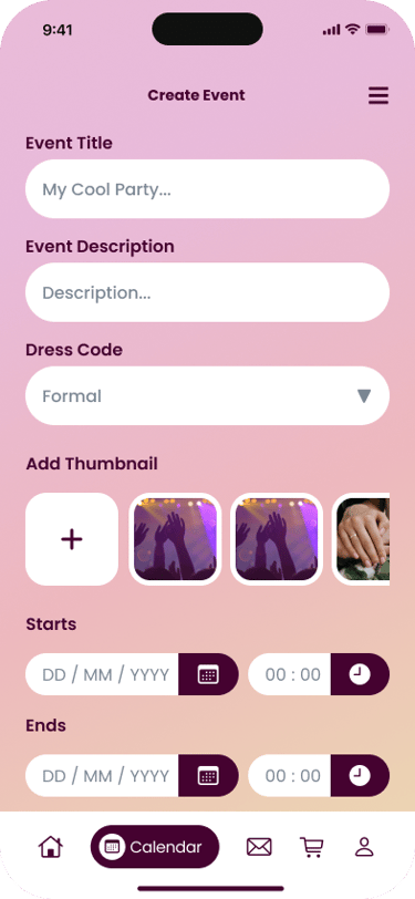
Create event
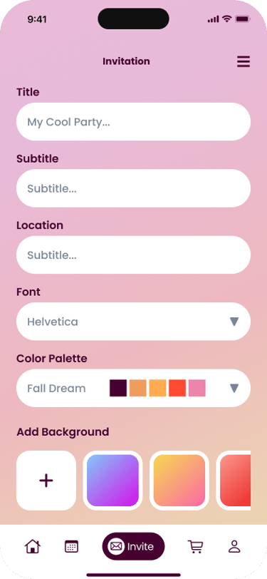
Title, dates, dress code, thumbnail setup
Invite
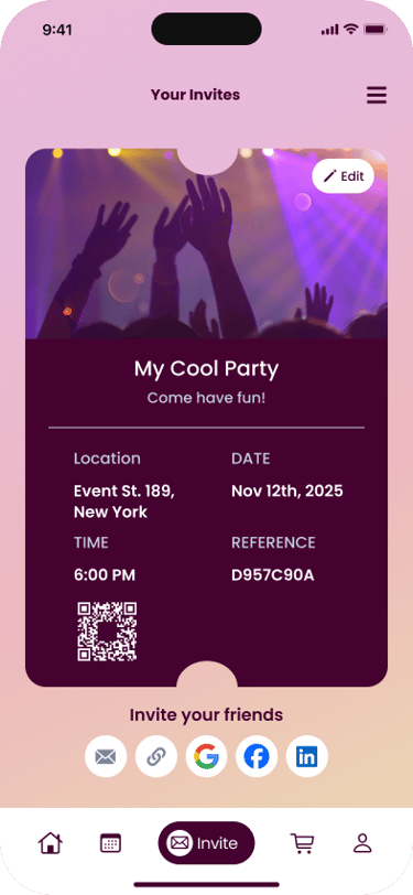
Design and share invitation via any platform

FIGMA PROTOTYPE
Try it out!
AFFINITY MAPPING
Interview insights were clustered into thematic groups to identify the most critical feature areas to design for.
RESEARCH
RSVP confirmation · Push notifications · WhatsApp integration · +1 guest links
Attendance
Maps & Venue
Live map embed · Floor plan with bathrooms · Reception layout
Gift Registry
Wishlist with store links · Direct transfers · Amazon / Target integration
Multimedia
Couple photo gallery · Post-event uploads · Shared playlist
Invitations
Templates · Animations · QR code · Media attachments · Dress code form
SO DO YOU LIKE MY STUFF?

Contact me for full-time, freelance oportunities or just to say a few nice words, I won’t mind at all.